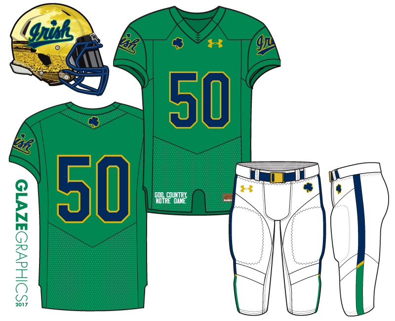
The Spirit football concept is designed for use in a future Shamrock Series game. Combining elements from the existing football uniform with color combinations and wordmarks from the basketball and baseball teams, the Spirit football uniform integrates the current school-wide Under Armour look and feel into a fun and fresh, but distinctly “Notre Dame”, design.
The helmet retains gold as the primary color, as all Shamrock Series uniforms do, but is now a sleek and bright “chrome” gold with the new “Irish” wordmark. This wordmark and associated shamrock are used throughout the jersey and pants design, as is the green and navy color combination, using gold as an accent. The white pants complete the clean, crisp look.
Traditional, modern, and all Notre Dame.


I almost loooooove this one. The script on the helmet is outstanding. As are the pants and 90% of the jersey. My only issue with the jersey is that the script on the sleeves makes them a little busy. An alternative could be the blue and gold stripe like on the base of the green baseball jerseys. (Below)
That’s a small nitpick, though, and I like them even with. They are my favorite so far. I think it’s the helmet script.
Look at those beautiful stirrups!
I don’t know if the script sleeve is busy at all, or at least, a logo or number is typically there anyway and feels pretty standard.
Would look really good as a shamrock series jersey. Would the helmet have that subtle shadowing of the stadium or is that a way to show that the helmet is so shiny it would reflect the stadium?
Yes the stadium is shown only to illustrate how shiny the chrome gold helmet is. I’m glad you like the concept.
Cool. I like it either way. Very sharp Clint.
Love these. Only quibble would be the stubble (the stadium) on the bottom of the helmets. They look like Mike Brey’s “beard” in the midst of a 8 game winning streak. Shave that off, maybe just the script on gold, and these would be my favorite uniforms.
I’m glad you like the concept. The stadium reflection is shown only to illustrate how shiny the chrome gold helmet is. The only graphic on the helmet in the Irish script.
Beautiful. Then I’m all in. Can we get an Observer ad going to get this concept in front of UA? I’ve got some crayons and markers to draw up the ad if somebody is willing to pay for the postage and envelope.
First, welcome to Clint on his first post and concept with us. It’s like the wizard stepping out from behind the curtain.
This is well done in part because it stays in the lane of modern Notre Dame athletic design but still feels new. I wouldn’t call it simple per se but there’s a simplicity to it that can be hard to pull off. And I think Clint did that.
I really like the pants and the pant stripe especially.
I can remember looking at this several times before noticing the stadium shot in the helmet. That’s pretty cool.
White helmets here would be spot on. Either with the script or a green shamrock outlined in gold.
So far all of the Notre Dame Shamrock Series games have stuck with gold (or mostly gold) helmets, so all of my concepts have some form of gold helmets for maximum “realism”. Thank you for the comments.
Yes.
I don’t LOVE the white pants, but it works.
Any chance we’ll see an option with a shiny gold facemask?
We are the dreamers of dreams.
What color helmet would you pair with a chrome gold facemask? Gold on gold?
@If it’s a gold facemask, aren’t we obligated to go with a matte gray helmet?@
Yeah, I’m thinking gold-on-gold.
If you went with the standard helmet, I would like these for the entire season. I have never believed the base jersey had to be navy blue with white numbers. I do think the helmet has to be clean though for the season. It could also work for a bowl game with the standard helmet. For Shamrock I like the logo and the stadium reflection.
Of the uniforms posted thus far, these are my favorite by far. These would be awesome for a shamrock game (if that continues)
Spot. on.
(assuming the image of the stadium on the helmet is just a reflection because the helmets are so shiny)
You are correct, sir. I’m glad you like the concept.
Really nice work. Can we pitch this to the powers that be to get this as an actual SS jersey, with you getting some royalties?
Now THIS….this one I like. Definitely the best of the bunch
Absolutely!
So, I stumbled across this little article: https://www.fastcodesign.com/90124059/why-we-should-all-wear-the-worlds-most-visible-color
I’ve long stumped for having bright green be the color of choice for ND fans and even think Under Armour can spin a profit out of it by making a “Gameday Green” line. I suppose Kelly Green would also make a lot of sense. Anyway, now that it’s scientifically proven (and has been for a long time, apparently) that bright green is the most visible color, can we convince the ND faithful that it would help with homefield advantage to unify our color scheme on gamedays? That way anytime we play some red team, it won’t look like they’ve overtaken the stadium.
OH SO LET’S LOOK JUST LIKE OREGON THEN.
I’m kidding, I love bright green and kelly green. However, I’ve got some hot takes…
I find myself caring less and less about unifying the crowd with a color. I think it’s born out of practicality for two reasons. One, too many fans just don’t care, or they won’t like the color, or it’s too cold to wear a t-shirt. Too many people just won’t play along. Two, I think it would be rather boring to have The Shirt be the same color every year.
A better idea might be to have the students wear The Shirt (changing colors every year) and then go with a bright green for the rest of the crowd. But, you could give away 70,000 shirts every game and I’d bet it’d be a waste of money.
Also, I was thinking about this the other day. Does a large amount of visiting fans really take away our home field advantage?
It stings for pride reasons, but other than that I’d argue it’s probably better for us. The fans tend to be louder which creates a more dynamic and hyped atmosphere more than it takes away from being able to hear on third down. I’d personally love 5,000 super rowdy visiting fans for every game. Plus, my other issue is that we always overestimate the amount of visiting fans in the stadium, it’s a pet peeve of mine lately.
Also, the Pantone Color Institute has chosen “greenery” as its 2017 color of the year.
https://www.fastcodesign.com/3066350/pantones-new-color-of-the-year-is-weird-and-perfect
Kind of a weird green, but I like it.