
The average cost of attendance to the University of Notre Dame reached $80,211 for the 2022-23 school year at a place with an endowment north of $12 billion. Setting aside the rather gross sky-rocketing price of college that has continued to plague generations of young people, at least we can say that things at Notre Dame have been improved and updated over the last 10-20 years.
Especially with the football program, there has been nary a stone left unturned. Hundreds of millions of dollars have gone into stadium renovations, locker room remodeling, new indoor practice facilities, updated weight rooms, in addition to new lounge and dining areas within the Gug complex. Plus, yet another expansion of the Gug is expected at some point in the near future.
It’s all beautiful. All throughout the locker room and stadium concourse you have this exposed tan and brown brick, mixed in with just the right amount of soft lighting, and Notre Dame insignia and branding. It all exudes class, which we know is so important to Notre Dame.
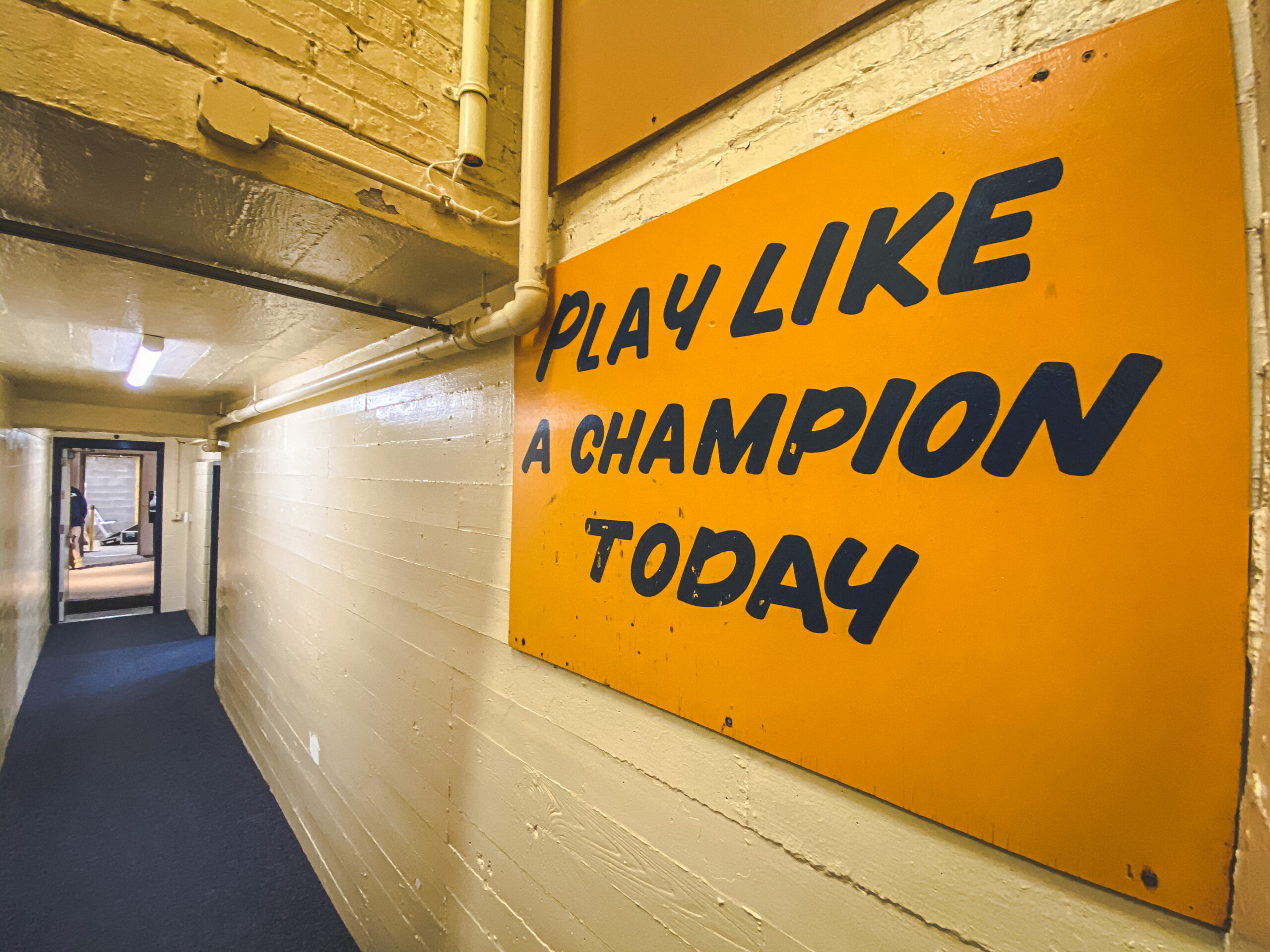
Then, you have the stairwell out of the locker room and down to the stadium tunnel:

This area has been frozen in time.
Some would say this is iconic, and maybe so. It also looks like something out of a small-town high school (which isn’t necessarily a bad thing!) but doesn’t fit in with anything else surrounding the football program.
Is it time to update this? I’m ready for any new ideas. Let’s walk through this entire fascinating corridor of Notre Dame Stadium.
Carpet/Railing: I like this part, anything that is a little bit more of a brighter blue and not the Yankees “this is basically black, blue” is okay in my book.
Walls: This is an abomination. It doesn’t fit the locker room, stadium, or anything on campus. It’s been this way for as long as I can remember and I don’t see the appeal of a creamy-white painted brick, especially when the rest of the whole damn campus and stadium have beautifully exposed brick. At the very least, this should be changed.
Lighting: Even back in the Lou Holtz days the locker room had lower lighting, and these days they’ve really embraced softer lighting everywhere in this area. Then you have this stairwell with fluorescent lighting that does not fit the vibe at all.
Miscellaneous: I’m no contractor, but it’s always been curious to me at how many pipes and electric work is exposed in this area. All painted over in that prison colored creamy-white. Is there nothing to be done about re-arranging these things? There’s a pipe directly over the PLACT sign and once you see it you can’t un-see that error!
Signage: I’m just going to come right out and say it: Let’s update all 3 of these signs. I personally like the white sign at the top of the stairs more than the PLACT sign (and any time I see that somewhere I know they are real fans) and would like to see a 3D concept put there.
With all respect to Laurie Wenger the typeface of her hand painted sign is a bit too close to Comic Sans. But, I realize that font is part of the iconic look for Notre Dame (and separates the Irish from the version we may or may not have stolen from Oklahoma).
They were on the right track inside the new Irish Indoor Athletic Facility (I’m not sure IIAC is going to catch on), that’s for sure. What if we took the stairwell in the stadium and turned the landing at the bottom of the steps into the Play Like A Champion Today WALL?
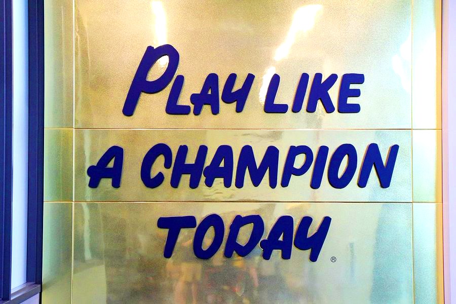
Wall >>> Sign?
I love it. The metallic gold and its majestic size, let’s do it. Do we really need the National Championship board above the PLACT sign? I say, ditch that entirely. Or, just move it somewhere else in the locker room or something. We’re upgrading the whole package.
Go Irish.

Asking the tough questions.
An aggressive take. On game week too!
In fairness, some of this stuff has probably been bothering the upper brass since the early 90’s but they surely thought they’d fix it the next time they had to bring down the sign to paint on the next National Championship…
Counterpoint: no.
OK I confess I was mostly going for the joke here. They could paint the walls and sure if they could get the pipe out of the way that’d be nice. Otherwise, let it be. Some things should stay the same.
I wouldn’t mess with it. Does look frozen in time, but I don’t think that’s a bad thing. Also, I know they upgraded/modernized the locker rooms but I did a tour in 2016 and the tunnel wasn’t out of place or jarring coming out of the old setup.
Messing with this would in execution end up like Yankees Stadium, I’d bet. The new stadium is undeniably much nicer and newer than the old. But it’s sterile, no character, just a lot of concrete and gray covered up by the modern bells and whistles. When you have a cathedral like Wrigley Field or Fenway Park or Notre Dame Stadium, you don’t need to mess with it too much, or what makes it special is gone.
If anything, maybe temporarily convert the stairs into a ramp, since apparently the QB1 has issues navigating steps.
I feel the opposite.
ND Stadium is a renovated old stadium with a ton of character and the updates have all been really well done.
The PLACT stairwell is sterile and just all this ugly concrete.
I don’t disagree on your first points, the updates have mostly been nice and a positive addition. But to the bottom part, to me the key is to know where the line is and stay behind it. You have to keep things that make it special, like yellow mums and the brick (not concrete) stairway as important ties to the past that add/retain that character.
I’d prefer a slightly dated/vintage look over a cheesy metallic gold design in the article, for instance. But to each their own.
Fenway blows and should be burnt to the ground.
Notre Dame Stadium is a masterpiece. Wrigley has some areas it could improve upon.

In fairness, that’s usually one of the best seats when watching the Cubs.
Live look at tlndma on Lansdowne Street:
There’s been at least one occasion on Lansdowne St when I could have used that.
Fully agree Fenway is terrible. Love having the park in the middle of the city (ever since I stopped commuting past it), but it really sucks to sit in for 9 innings.
I’m very much with you on the locker room should be field level. Have felt this way since the first time I saw players walk down those stairs in cleats.
I would be ok with the exposed brick instead of the white parochial school paint. Outside of that I think keep the tunnel/walk as is. My guess on the lighting being brighter is for the tv cameras/plus walking down stairs in helmets.
Other comments – amazing how bad they screwed up the 97 expansion, but very much in line with the overall tone of the administration/athletic programs at the time. Half ass efforts should equal excellence just because we’re notre dame.
The 2017 remodel is so much better. One nit, they need to finish the 4 corner gates on the exterior. They kept the old concrete look from the 97 expansion instead of tying into the the additions. Frustrating that they put in 90% of the effort, but didn’t complete their circle.
The biggest change that needs to come back and one that I think made the old Holtz games the best on TV is the moveable bleachers in the endzones and corners. We have to get that back and get fans those seats. So awesome seeing a big score and celebrating with the fans right there. That should be the first thing that is brought back.
I think the “boring” stairway is something to keep. It’s very metaphorical. Push through this boring stairway and /boom/ game time.
I like most of your ideas. However, dont mess with the sign. The sign stays the same. Exposed brick, better lighting, move the damn pipe, all good ideas, but the sign and its font must remain untouched. Its like the shamrock series uniforms – for the most part they work as long you keep the helmets gold (i’m looking at you pinstripes).
As long as we’re proposing: since other teams have adopted Jump Around, is there any way to incorporate Shamrocks & Shenanigans into the gameday atmosphere? That was always my favorite song on the album (yes I had the CD when it came out). I like to imagine the whole stadium going nuts to “BOOM SHALACKLACK BOOM!”
https://www.youtube.com/watch?v=-TZhJtgcNEI
While we’re at it Let’s re-make the godfather, lord of the rings, and add a few brush strokes to the mona lisa
Haha partially kidding. In the end it’s just football who really cares. Go for it
The Mona Lisa does have new brush strokes. The one people stand in line hours to see ain’t DaVinci’s???? She gone.
Two movies re-made from books (with sequels galore) and a painting that’s gone through a million hours of restoration.
Supports my article!
In unrelated news, the best Texans reporter said Kurt Hinish will make the Texans 53 man roster after a very, very good preseason.
And I saw Kevin Austin got cut from the Jags but could be a practice squad option for them. Only two ND names I’ve seen so far.
Not 2022 draft guys, but:
Ian Book waived, NOLA wants him on the practice squad assuming he clears.
Khalid is starting the season on the IR for the Bengals.
Kmet is finally the every down TE for the Bears.
Daelin Hayes got waived from Baltimore too. I saw Nick Martin’s name on the cut list too, I didn’t even realize he was still hangin’ around.
One of my friends is a big 49ers fan and said they had a starting guard job open and hoping for Banks to take, but he hasn’t played that well and an undrafted player might beat him for it.
In happier news:
Julian Love was named a captain for the Giants, they love him. There’s a cool story where he was an emergency holder in a preseason game and did well after the kicker got hurt during the game and the punter had to kick and they needed a holder.
Miles Boykin made the Steelers, who also had Javon McKinley in camp for a short time too. Nice Notre Dame WR room there with Claypool in the mix too.
Book claimed by the Eagles. McCloud claimed by the Giants.
I’d get rid of the sign that reminds everybody it’s been over three decades since a natty.
https://twitter.com/i/status/1564594527691759618
Who wouldn’t want to make that walk on an autumn Saturday ?
Literal tears here myself 🙂
Thanks a bunch, tlndma. Eric, I am often admirative of your taste, and certainly for your attachment to ND, our football, our tradition, our values. On mature reflection, aided I admit by my knowing the insides of the locker room since I was 7, plus Holly’s walk — I vote, don’t touch a thing.
I’m sure everyone here has heard it before, but among the big risks in joining the Big 10 is that your program ends up like Penn State, case in point, apparently they’re playing at Purdue this Thursday night.
No. Thank you.
That was interesting timing. I wonder how much is counter-programing for the Pitt/WVU game on Thursday too. Pretty weird and unfortunate for the PA crowd that those games are head-to-head for whatever reason on a weekday before Week 1 really gets going.