

Notre Dame football unveiled their 2026 Shamrock Series uniforms on Wednesday morning via a near 2-minute sharply produced video HERE heavily describing the ties between the Fighting Irish and Green Bay Packers NFL organization. It confirmed the leaks recently that the team will be wearing altered navy blue jerseys when the season opens up against the Wisconsin Badgers inside Lambeau Field later this year.
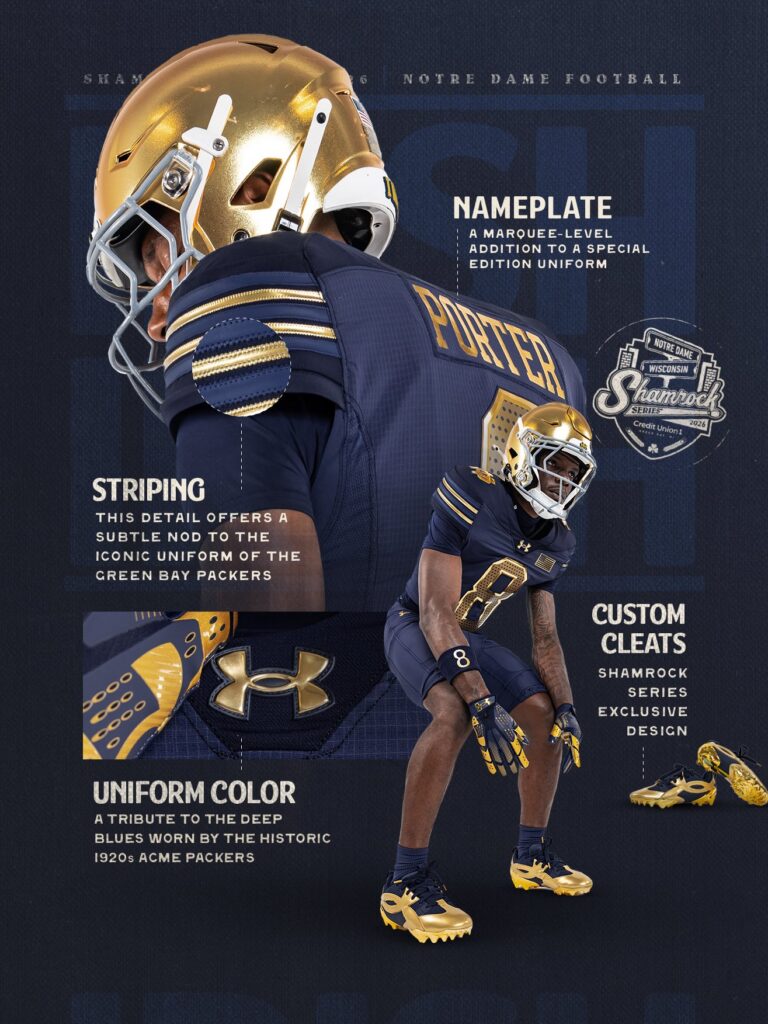
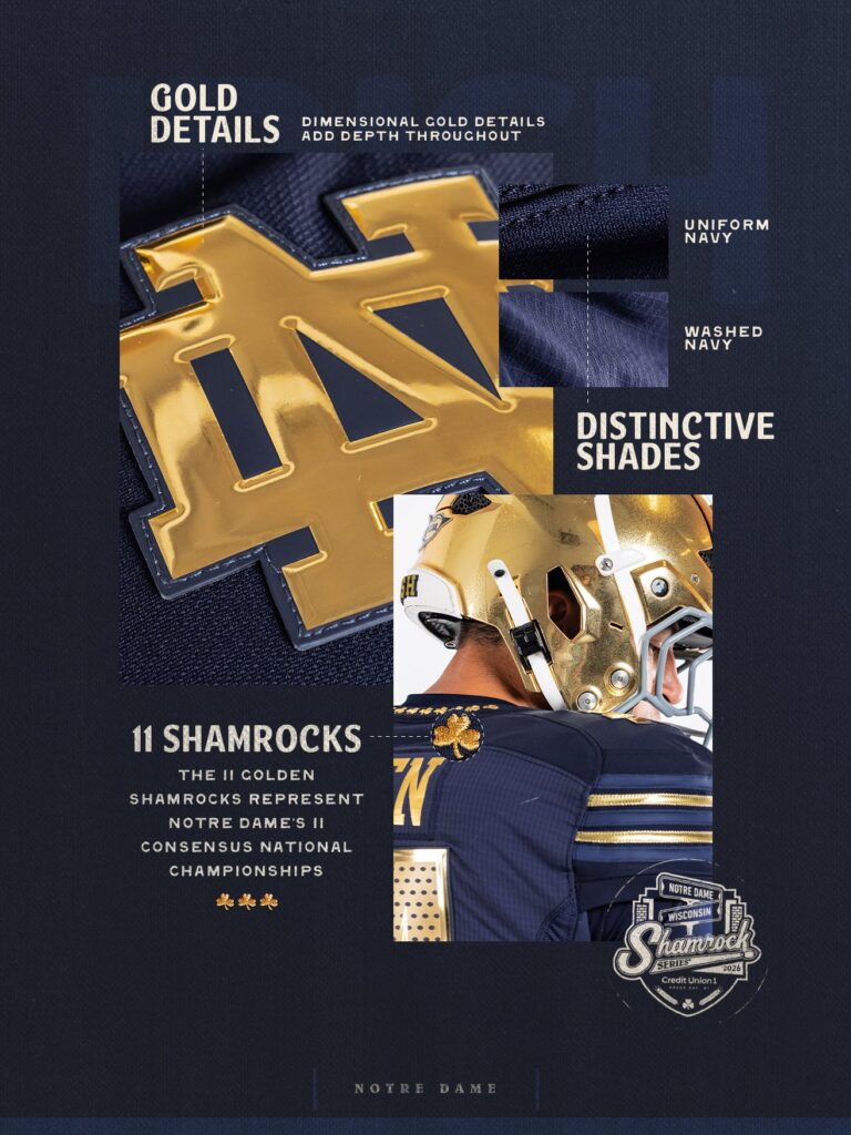
Continuing a trend we’ve seen recently, the team will be sporting a bunch of shiny metallic accents on the jersey. Although the traditional helmets look unchanged for the alternate uniform, the team is poised to wear plain navy blue pants with blue and gold accessories.
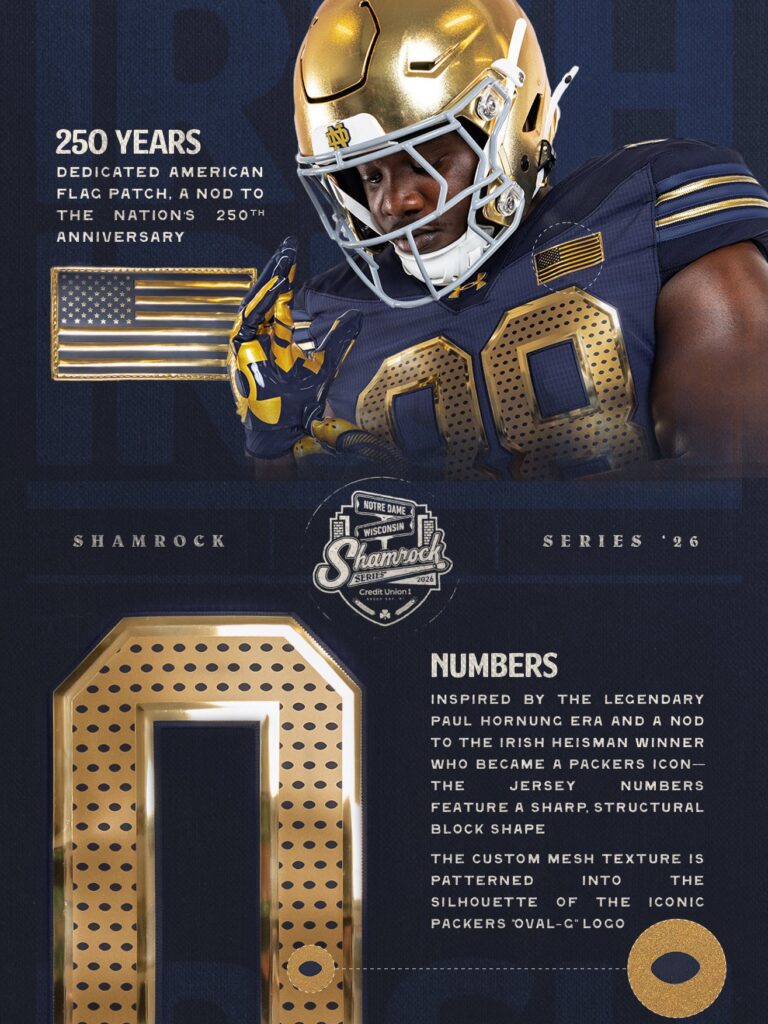
Here are the promotional photographs released by the school:
Shamrock Series Uniform Grade: C+
The early reviews of this uniform suggest it’s inoffensive, maybe a bit boring overall, but the overall package looks improved over the recent jersey leaks (which, we should point out, replica leaks always look bad in general). I tend to like the shiny metallic gold for uniforms like this and thought the overall vibe is similar to the 2024 uniforms in New York City where the Irish also wore all-blue (although more of a blue-gray).
The 11 shamrocks on the back collar looks cool and as always I’m a fan of nameplates. Surely, we can’t be very far away from nameplates on the standard jerseys–just do it!
Otherwise, I’ve got issues with many aspects of this uniform.
What’s the reasoning for blue pants? There’s no historic connection with the Packers, and if you’re going to wear blue why plain blue pants again? At least put some of the mixing blue colors on the pants too, maybe more shiny gold accents too.
The American flag is dumb and serves no purpose tying into the connection with Green Bay. I find it kind of shocking that this is part of the uniform to celebrate America’s 250th birthday 2 months after the fact.
Not a single soul on earth would understand the navy and washed navy colors or the football silhouette inside the numbers as connections to the Packers.
Overall, these are the type of uniform packages I tend to despise, even if it doesn’t look inherently bad. The details are too small, too obscure, and really don’t hold any meaning. No one is going to turn on this game and think, “Oh, cool that’s Notre Dame wearing Acme/Green Bay Packers uniforms at Lambeau Field.”
Most of all…
WHY ARE WE NOT WEARING GREEN!?? IT’S THE SHAMROCK SERIES…IN GREEN BAY!!
This was the easiest lay up in Shamrock Series history. The branding for the event and the logo is green and we’re going to be wearing all blue, it makes no sense.
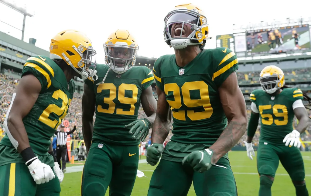
These 1950’s throwbacks but with gold helmets and small tweaks would’ve been FIRE.
Yeah, the Acme Packers wore blue but they also wore yellow-gold trim and definitely not blue pants. A real attempt at a 1920’s throwback would’ve at least offered some character and I would’ve respected the attempt. Plus, the Paul Hornung connection means green. The Packers have been wearing green for the better part of 100 years!
I have a hard time thinking about these uniforms being cooked up, with the association with the Packers being the primary driver, and then an all-blue uniform being green lit for the project.

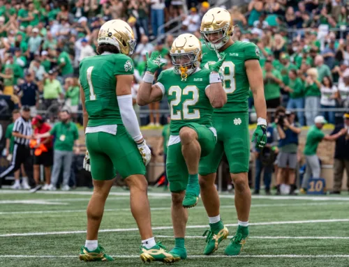
Green was definitely the way to go. But let’s face it, the Shamrock Series has been corrupted by the dark side for years.
Counterpoint: Honoring the Packers at all is a mistake. The Bears will soon be an Indiana team, we need to embrace the hate.
Yeah that blue pant just makes it way too bland.
ChatGPT’s attempt.
Or Gemini (is this Rugby?)
Gemini 2 – I mean if we can make a faux leather helmet why not faux leather pants?
This is a leak of the 2031 Shamrock Series uniform while the US hosts the rugby world cup.
And the hits just keep on coming! Worst SS uni since 2018. It seems like they are running out of ideas which is NOT the issue. Or maybe they are just getting complacent. The latter, a trait they sometimes exude. A quick consult with you, Mr. Murtaugh and they would have designs for years to come!
I understand Freeman’s reluctance to touch the iconic gold helmets and I can and do appreciate that. C’mon now at least throw us a bone when the rest of the uni is less than inspiring. Whatever happened to those matte blue helmets with gold chrome shamrocks and face masks that were “supposed” to have been worn against Wisconsin in ‘21? Lastly why would you ever tarnish what is holy by associating it with cheeseheads! 🎤
ehh, I’m not the biggest fan of Argentina’s current World Cup kit
Not bad. I think the players really liked the 2024 shamrock uniforms, so I think that was a contributing factor. Mild irritation: I really don’t like when design presentations contain the phrase “a nod to”
Do you not support America and the troops Eric????????
Not very good.
Strange take on the flag. Both teams doing it together, 250 celebration an all year thing, etc. Seems there’s some weird underlying thing behind it you won’t write.
Would have gone gold pants as this kit is so dark our guys will disappear. I’ll never understand the obsession with color on color. Just looks terrible.
Would have loved some Packer green, but, whatever. Go hammer the Badgers!
Why is it strange? At best, the flag is a minor part of the “story” of the rest of the uniforms. It’s inclusion seems odd.
Also, I’m big on if you’re going to do the flag, do it in the correct colors. For example, the flag has been on the back of the helmets for many years (since 9/11) and they wore color-correct flags on the left chest through 2003. If they end up doing that for the 2026 season that’s fine.