
The countdown continues. What’s your favorite logo so far and will anything today surpass it?
All logos and information are courtesy of SportsLogos.Net.
#45
Virginia
Type: Primary
Years: 1983-1994
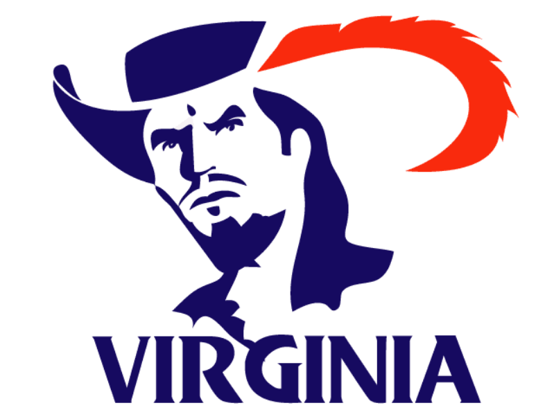
Virginia went through a subtle re-brand in 2020 that updated their longtime “V” logo and put more emphasis on their swords. I’d like to point out this primary logo from the 1980’s was pretty awesome. I’m not sure why the orange feather isn’t connected to the hat and I keep thinking there’s something in the empty space that has meaning. You could probably update this logo to involve the outline of Virignia in that empty space.
#44
VCU
Type: Primary
Years: 1989-2003

VCU used to have several incredible logos with their ram and in 2014 switched to a boring script with a horn coming off the “V” that looks more like a ribbon than anything. Then, they introduced plenty of sillier looking rams as alternate logos. Today’s logo above created in 1989 was a great combination of what the school had been trying to achieve. Stick with it!
#43
California Riverside
Type: Alternate
Years: 2020-Present
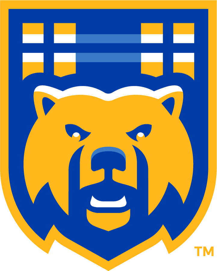
This is 1 of 2 logos to make the top 50 with the use of tartan pattern. The little known UC Riverside Highlanders have carried some really quality secondary and alternate logos throughout their history. In 2020, they moved to a brutally boring block letter primary logo but created a couple gem alternates including the bear above (which should be their primary logo).
#42
Memphis
Type: Secondary
Years: 2003-2021
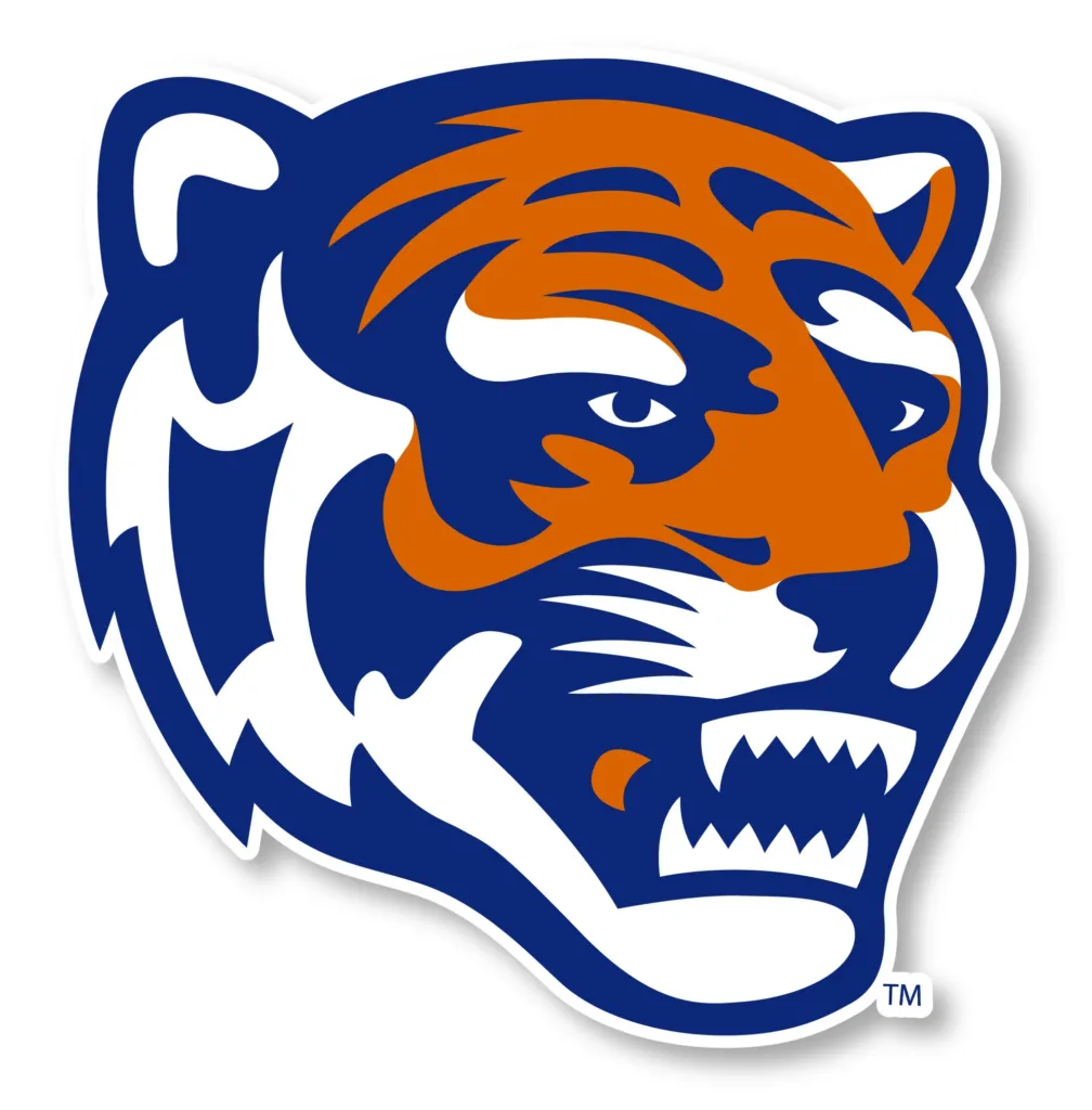
You are probably familiar with the primary logo for Memphis where the tiger is jumping over the block “M.” If you look closely, that tiger face is very similar to this tiger face, except it’s not. Something just seems off about this face, like the tiger isn’t quite right. His teeth look weird and everything, like a serial killer wearing a tiger mask. But I love him, and I was disappointed to see Memphis update this logo in 2021 to fix some of it’s “uniqueness.”
#41
The Citadel
Type: Alternate
Years: 1987-2021
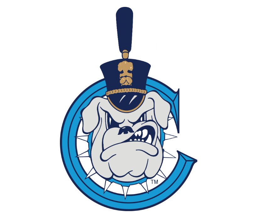
Bulldogs are maybe my least favorite dog in real life, but I love a good bulldog logo. The Citadel re-branded back in 2021 and currently has a primary logo of block C with a star inside of it. It always makes me think they are Columbia who has the same light blue and navy colors. This snarling bulldog with spiked collar and cadet hat inside the block C logo is way, way better.


On that Memphis Tiger logo, not sure it is the teeth that are off, I think it is the negative space of the lips and mouth in general that give it the odd appearance.
To me, it is the left eye and left side of the nose that seems off
At first I thought it was the eyes, maybe the pupils make it look too human… uncanny valley-ish. Anyways, so I screenshotted it and whited out the pupils but it looked worse, like an evil possessed tiger. So IDK. It’s sure weird though.
The UVA logo is so good. This series is giving me some throwbacks to when I was like 7 and they would show scores and highlights at halftime with some of those logos featured.
i was recruited by the citadel and have had some family go there so i have a decent amount of clothes with that badass bulldog logo
The Citadel logo looks like a draught tap
Drink up.
Sounds like Owen Wafle decommitted. Always sad to see our first commit leave, but he’s been slowly dropping in the rankings, so not the end of the world considering the DL we are still in on. However, he seems to be the only one destined for DT/NG (listed at 290lbs on 247), assuming we don’t land Justin Scott. Also, not sure why he would have dropped after his JR year. His stats were extremely impressive, 64 tackles, 43 solo, 24 TFL, 10 sacks.
Could this be a him reading the writing on the wall, or us nudging him out the door? 247 suggests that Michigan might be a big player, and now On3 has updated them as the likely landing spot, if they are after him, might not be the case of us pushing him away. So basically, any thoughts on whether this was more his or ND’s decision?
I was much less excited about him when I learned his name isn’t pronounced waffle.
I just said this in our Slack, too. It’s a legit rationale.
I was so excited for the AWFUL WAFFLE chants. AYFUL WAYFUL sounds too British.
I mean, he and his family can pronounce it any way they want, but we all know how every single announcer is going to pronounce it.
Let’s get Hammond’s input on this name.
Seems like it was truly mutual to me, reports are he visited Michigan unofficially in April, like you said, player had a foot out the door or at least seeing what was out there before today. And Notre Dame has been recruiting over him, I can’t imagine they’re too torn up about moving on either. Doesn’t seem like much a big deal to me, commiting like 18 months before signing day leaves a lot of time for either side to look other places.
I don’t think you’re right about DT/NG, 247 is liking Notre Dame’s chances for Sean Sevillano Jr. a 300-pounder from Florida (by way of Canada). A lower 3-star but his official visits are Ohio State, Auburn and ND so he might be bound to raise a bit considering the quality of programs who are after him.
Nice on Sevillano. I hadn’t heard that name before. Ridiculous numbers as a JR, even better than Wafle. 78 tackles (50 for loss) and 22 sacks. Looks like he moved down to FL from Canada and plays in what sounds like a small league. Makes sense he’d be lower profile at this point. That size and production would have to put him in at least high 3 star territory eventually.
I don’t like going head to head with Ohio State, especially when a school like Auburn is his other perceived leader. But let’s goooooo.
Almost 2/3 of his tackles being for loss is hilarious. Those poor centers and guards.
RIP 2:30 kickoffs all the time
https://twitter.com/NDFootball/status/1661446974573527041?s=20