Thanks to places like Homefield and Homage we are seeing a revival in old-school college sport logos. With that in mind, I’m going to bring you the top 50 alternate logos from across the country. Simple and fun. Here are a few stipulations:
1) We’re limiting this countdown to Division 1 schools, because researching past logos of D-II and D-III schools would be far too difficult.
2) I am counting alternate logos, secondary logos, old logos, and primary logos that are no longer used as a school’s main logo.
All logos and information are courtesy of SportsLogos.Net.
Here are 12 that just missed the cut, going in alphabetical order:
Arizona
Type: Secondary
Years: 1990-2011
I’m not going to feature too many logos with script but this old one from Arizona is an exception. Their current “A” main logo is fine, I’ve always been partial to this wildcat. It reminds of an era when Arizona wasn’t losing in the first round to a 15-seed.
Arkansas
Type: Secondary
Years: 2014-Present

Arkansas’ main pig logo from the side has been around for nearly 100 years in different variations and is pretty cool. This newer head-on creation from 2014 is great, too. And it’s an excellent example what encountering a razorback in the wild looks like from our perspective.
James Madison
Type: Primary
Years: 2002-2012
This bulldog logo stretches back to the early 1970’s and in the 1980’s they put Duke atop the JMU letters. Today, all they have are the letters as their logo for one of the worst in college sports. But this bulldog and his crown and cape are legendary.
La Salle
Type: Secondary
Years: 2004-2020

LaSalle keeps flip-flopping from good logo to bad with their current one being pretty terrible. For over 15 years starting in 2004, the school incorporated this explorer logo above into their main crest. It’s also really great on its own, as seen in this secondary logo.
Louisiana
Type: Secondary
Years: 1999-2006

Louisiana “don’t call them Lafayette” have been using a new script logo for the last 6 years. It’s different as far as college branding goes but nothing compared to this fiery fleur-de-lis that was part of the school’s main logo for for nearly 20 years. As a stand alone logo, it rocks.
Maryland
Type: Primary
Years: 1970-1983
Pound for pound, Maryland may have the best collection of primary, secondary, and alternate logos in all of college sports. I feel bad for not including this jolly Terrapin in the top 50 list.
Murray State
Type: Secondary
Years: 2014-Present

Murray State’s primary logo these days is fine but it’s really busy featuring a block letter, jockey on a horse, and two levels of script. This simple block M with the racing print is incredible.
North Texas
Type: Primary
Years: 1973-83

We featured this flying worm logo thingie in a Weekly Rambler article a while back when North Texas wore throwback uniforms in a recent football game. He’s pretty confusing and awesome at the same time.
San Diego State
Type: Secondary
Years: 2002-2010
We’re going to be straddling the thin PC line with some of these logos. San Diego State has put together some really sharp logos and this old secondary offering was top notch. Did you know their live mascot wear’s a headdress with a big skull sitting on the forehead and top head area??
TCU
Type: Secondary
Years: 1966

This logo amazed me for being used for 1 year only and for being nearly 60 years old. That’s the most modern looking logo from the 1960’s in the history of sports. And it would be a great throwback option for TCU today.
Toledo
Type: Secondary
Years: 1995-1997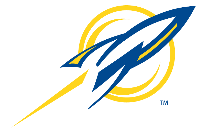
It feels like there’s so much potential with Toledo and their nickname but for the most part they fall short with their current branding that hides the rocket behind a bank of script. I really like this stylized rocket on its own.
UAB
Type: Secondary
Years: 1996-2003

This dragon was created in 1996 and in 2009 they used the neck up inside a shield for a primary logo then took the shield away in 2015. I’m here to support the full-body dragon which was used for a while with a darkened version also used until 2015.


UAB gets extra points for the big, beefy arm…coming out of the back of his neck, there.
The issue I have with the UAB logo is there’s nary a consummate ‘v’ anywhere on the body of the thing.
UAB:
CONSUMMATE Vs
I have a hard time believing there are 50 better logos than that Arizona logo. So clean.
Perhaps I should let you know each time you are wrong and there is a worse logo in the 50 than the Arizona logo 😉
I have a hard time believing that there are 50 better than *any* of these!
They all pass the look-back test, as in if I scrolled past any of these I would (and did) scroll back. I have to think most (all?) current main logos would fail this test for me?
I was so confused about the flying worm until I looked at other pics where the beak is more clearly defined from the eye. You can’t even see that intent in the above pic, it just looks like some kind of 2-headed flatworm (or worse if your mind is in the gutter.)
That San Diego State logo rocks!