
Welcome to this website’s off-season sports sartorial content. We are counting down the world’s top 50 most iconic sports uniforms. Only current uniforms apply, we are not including one-off or alternate uniforms. Let’s stick to the basics.
#24
Real Madrid
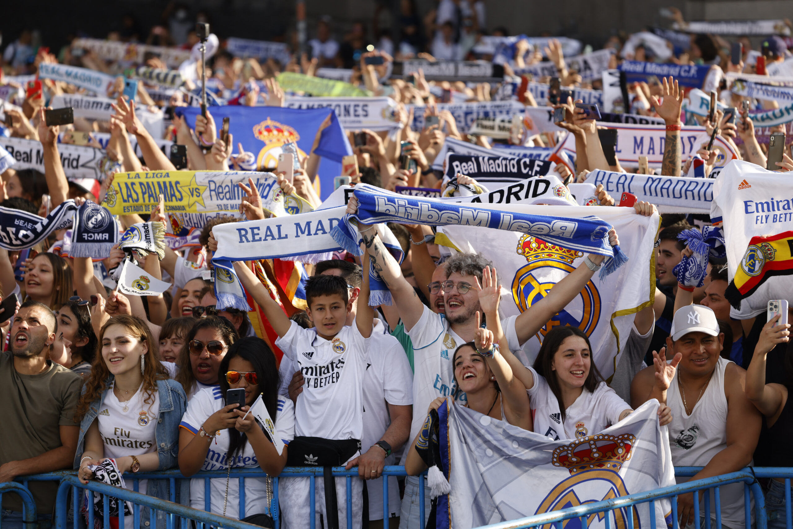
At no. 24 we have Los Blancos from Madrid. Valued at just over $6 billion this is the richest sports franchise outside of the United States. Today will be an excellent look at how winning breeds memorable and recognizable brand recognition for a uniform. Real Madrid won their 70th trophy this year and look like solid bets to win the Spanish top flight La Liga for the 36th time this spring.
Their kits are so important to international football that Adidas is paying over $130 million per year to make them and Emirates are paying $75 million per year for the main shirt sponsorship.
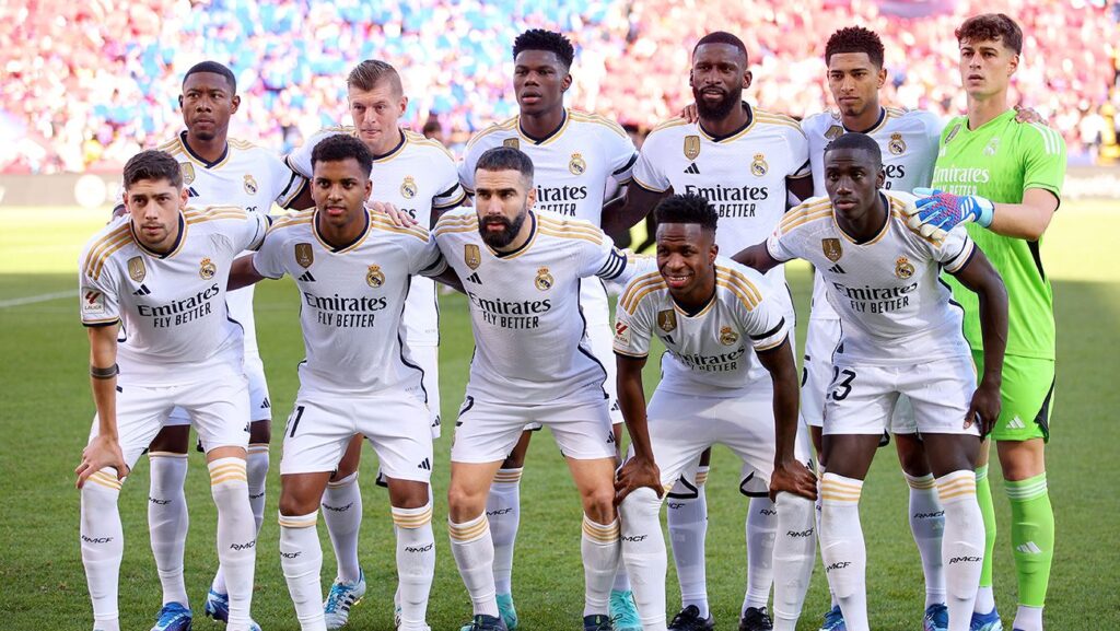
From the very beginning, Real Madrid took the field in plain white jerseys. Originally, the club crest was plain blue of interlocked “MFC” for Madrid Football Club before a crown was added atop the logo in 1920. They dropped the crown in 1931 but 10 years later what would become the modern logo was designed.
In 1941, Madrid switched to a gold interlocking logo with a gold and red diamond-studded crown sitting atop. Additionally, a plum colored sash ran diagonally behind the logo. Things have been simplified and tweaked twice since then, including most recently in 1997 and again in 2001. Today, the team has a similar logo with the major change being a blue sash instead of purple.
When I say plain jerseys, they played for decades with nothing else on them. Not until the 1970’s when very light red trim appeared and later in the next decade purple trim. Through the 1980’s and 1990’s their home kit was exclusively white with purple trim.
Since 2000, the club has used gold, navy blue, and black as the primary trim color with the latter color being the most used overall. For the current 2023-24 season a combination of gold and black is being used for a familiar modern look.


How could an airline have the best uniform?
Because they do.
A kit is what you build a model airplane out of.
They dropped the crown in 1931 but 10 years later what would become the modern logo was designed.
Not coincidentally, Spain herself dropped the crown in 1931 for about 10 long and turbulent years…
See, I love the historical facts.
Happy ending for the crown though, as in 1975 young King Juan Carlos, instead of becoming a figurehead for the continuation of the Falangist dictatorship, skillfully guided Spain’s transition back to a functioning democracy and reintegration into the European community.
Mmm, this is the first one where I’ve been like “wow most of the ones already in the series thus far are much better than this one”
It’s a list of “iconic” uniforms and Real Madrid is one of the most iconic teams in the world.
Now, for a lot of their history has the jersey been essentially a plain white shirt, then with a club crest? Yes. But there’s a reason why other teams have copied it and it’s so recognizable.
That wasn’t my downvote FWIW, but if we’re going with pure icon status then this is top-5 or top-3 I suppose (and the Yankees would probably be #1? Snooze). Part of it is aesthetics, and this one is just kinda dull, but it has enough flare going on that it’s not set up in a classically plain way like Penn State/Alabama unis. Just one man’s opinion.
I see what you did there. All blacks and all whites back to back. Nice.