Welcome to this website’s off-season sports sartorial content. We are counting down the world’s top 50 most iconic sports uniforms. Only current uniforms apply, we are not including one-off or alternate uniforms. Let’s stick to the basics.
#29
Texas Football
I’ll be honest, I didn’t want to do this. If this were purely a list of my iconic uniforms for my taste only then Texas would not be making it. Burnt orange as a color is putrid, disgusting, boring, and dull. It wants to be orange but can’t help but throw itself in the mud. It’s the fecal matter of orange.
Setting that aside, for me it was an easy decision to pick the all-white Texas road uniform as their iconic set. Their home jersey looks okay but this storm trooper look has always been fantastic. If you can look past the burnt orange.
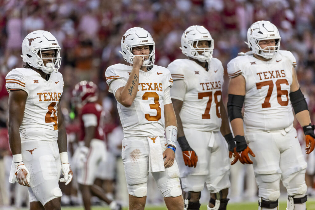
This white jersey with “Texas” emblazoned on the front debuted in the late 1950’s and a few years later they were using the shoulder sleeve stripes, as well.
The longhorn logo (officially dubbed the Royal Longhorn logo) was created in crayon by a local sports good store owner and put on the football helmets for the 1961 football season. If we’re being honest, when it comes to Texas football it’s the logo that makes everything iconic.
Their used to be player numbers above the helmet logo but that was dropped a few years down the road in the 1960’s. From 2014-16 the team used a metallic longhorn logo, then switched to a much brighter color, before settling on a far darker shade since the 2021 season began.
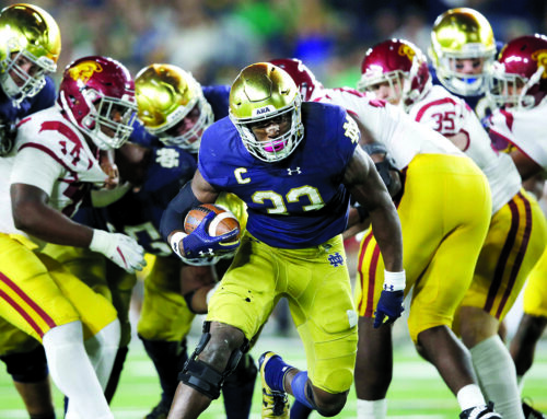
Couple of family members committed during/after Pot o’ Gold. Bettis Jr, finally, and mini-Faison for the first ’26 commit.
I’ll admit this is the first time I’ve looked at one of these uniform articles.
There’s been good coverage on recruiting and our commits as they announce on other sites. OFD and ISD, for example, had good articles. Irish Envy has some great insights on recruiting/prospects from posters.
Brendan and Tyler last wrote about a recruit’s commitment in Dec 1 and mid-Nov respectively. Murtaugh did write a couple on Signing Day.
The ND coaching staff is doing an awesome job recruiting.
MC checked the archives.
Agree with your assessment E — not my personal favorite, but I can see including it
Choosing Texas here is 100% perfect troll, great job.
I’ve always been fine with the uniform-they’re one of the few I’m ok with wearing all-white because it’s not forced. One thing I’ve noticed in person and on tv is that the helmets are a different shade of white than the jerseys. I haven’t seen this as much with other white helmet teams, so it’s slightly irritating once I notice it.
I don’t know, I’ve always liked burnt orange. It’s unique in a sea of slightly different variations of other colors. Do they even have a secondary color? If you see that color, you think Texas. Or, I guess, terra cotta roofs. Or baby poop. But I think you were right to put it in on the list.
Seems about right for Texas. You had OSU higher than I expected, so maybe I’m missing some that I’d put just outside the top tier of iconic uniforms (Trojans or Gators, maybe), but at this point I’m down to just Notre Dame and Alabama for the list as far as college football uniforms go.
I’m also curious if you pull any yet-to-be-seen sports in. My list would admittedly lack some, I’m sure very important, soccer uniforms, but it would include at least New Zealand All Blacks rugby uniforms and the Australia National cricket uniforms as the most iconic of the respective sports.
A few more CFB uniforms to go.
I didn’t include Aussie cricket, though. It was suggested in the Slack group chat. I don’t know enough about the sport and it looks like they change their uniform often? Or is it usually the all bright-yellow?
Spoiler, All-Blacks are in!
The bright yellow has been their standard for a lot of years with a few black alternates thrown in, they went through a gold/tan experiment and put out four different versions between 2007 and 2010, but then went back to the bright yellow.
Plus the Aussies are dominant in the Cricket World Cup (6 wins in 13 tournaments), so it’s kind of like if you combined the Netherlands’ World Cup uniforms with Brazil’s success (5 wins in 22 tournaments), it’d be the focal point of a lot of soccer posters.
The only other rugby one that comes to mind is South Africa Springboks, which Matt Damon wore in Invictus, but I don’t know that I’d feel compelled to put two rugby uniforms in this kind of list.
I expect haka clips in the all-blacks article!
Incorrectly crap on the Burnt Orange all you want, but it’s instantly recognizable as the University of Texas Longhorns and no one else. Also, I think that this orange looks like Texas, the state. I assume it’s somewhat self-fulfilling as I identify the color of the college sports teams as part of Texas, but I feel like it blends in with the geography. It’s a natural looking color and I can picture that color occurring in (presumably) western Texas. Same can’t be said of yellow & black in Pittsburgh.
Irresistibly Texas.
I mean, that’s eerily close to my wedding tuxedo, except with brown pants. Didn’t have the creepy-ass smile, though.
Isn’t it yellow and black because of the city flag?
I don’t know what it’s for, but my point is, you wouldn’t walk around Pittsburgh and think, “yellow and black”
I fortunately have never driven across west texas, which I guess isn’t actually particularly close to Austin, but I definitely picture is as just vast burnt orange landscape.
Paired with a burnt orange sunset