
Writing about 20 underrated sports uniforms from college football, NFL, MLB, NHL, and NBA. One uniform at a time.
The Pirates haven’t made the playoffs over the last 9 seasons and taking a peek at the current MLB standings that is going to extend to a full 10 consecutive seasons. It’s tough out there, but at least Pittsburgh has nice uniforms! For the second time in a week, we also feature a black and yellow Pittsburgh franchise with underrated uniforms.
Originally, I wanted to include the Pirates’ gray uniforms. As previously stated, I love a really nice clean road gray uniform in baseball. However, I was looking things over again and had to switch to the classic white Pittsburgh uniform.
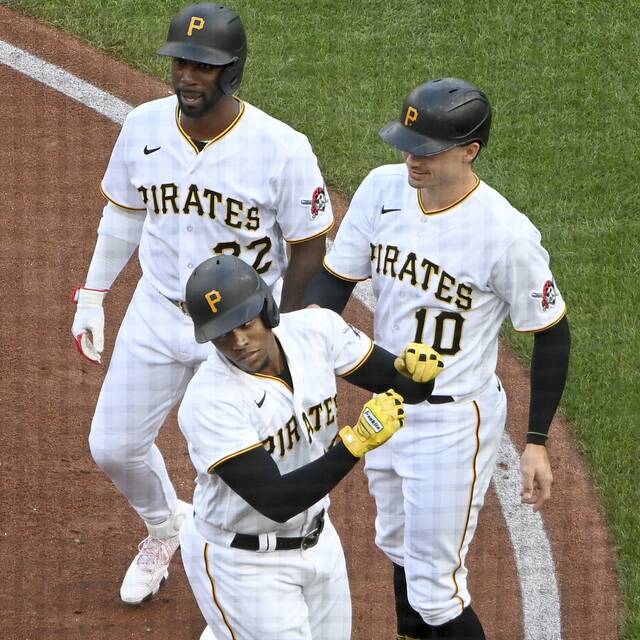
Pirate patch adds excellent flare.
The typeface that the Pirates use is so incredibly underrated. It’s unique, fits their look really well, and still fits within a baseball uniform without looking too cute. Somehow, it looks both modern but also old school, it’s really a great touch for the uniform.
They don’t try to overwhelm the jerseys and pants with color, it’s nice tasteful black and yellow. The hat/helmet is iconic, as well. Add in the pirate patch and it brings everything together so nicely.


Love the whole pittsburgh setup. Love the coordination/color scheme across the three franchises. personally I think they all have great names too. Color scheme, team names and the city are a great marriage