
What are we doing? We are ranking the best Notre Dame football uniforms in modern history in a three-part series. Today, we unveil Part II and the middle group of uniforms. Check out our introductory post explaining the grading as well as the first article detailing the worst home blue uniforms for the Irish.
Ranking Notre Dame Football’s Home Blue Uniforms: An Intro
Blue Uniform Rankings: The Bottom 5
Now, we really start to see the good uniforms.
#10 Late 1960’s
Tradition (3): 2.9
Style (2): 0.4
Success (1): 0.7
Package (3): 2.1
Total Score: 6.1
Our oldest offering included in our rankings, this is the standard which set up decades of modern Irish football uniforms. Bright navy blue jersey, glimmering gold helmet, shiny mustard pants, and long white socks with blue at the knees in addition to black cleats.
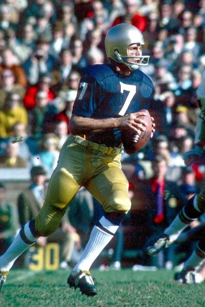
This is the template all Notre Dame uniforms were born from that we see today and it’s always been beautiful in its simplicity. Obviously, it is an extremely basic jersey adorned with nothing but a player number on the front and back. At least there are TV numbers too!
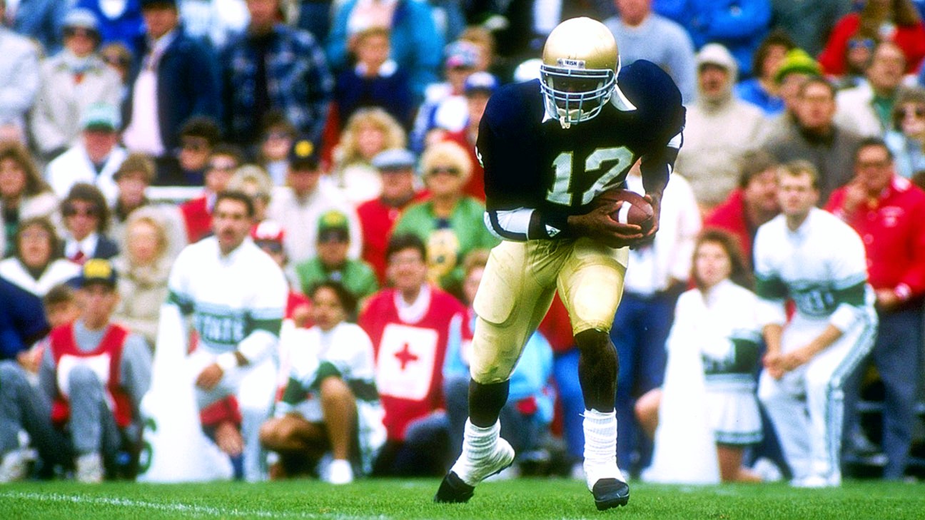
#9 1994-97
Tradition (3): 2.2
Style (2): 1.6
Success (1): 0.3
Package (3): 2.1
Total Score: 6.2
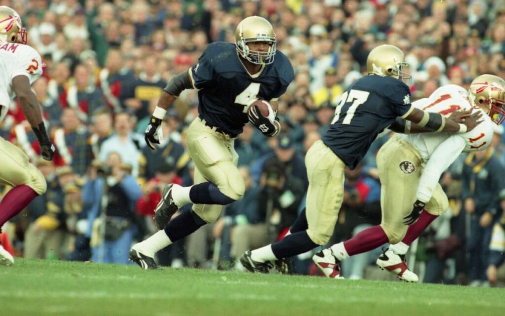
Notre Dame unveiled new uniforms similar to this set in 1992 but when the season opened 2 years later they came out with an updated version. The gold collar and cuffs remained (quarterback Ron Powlus pictured below cut his sleeves open so the gold trim was removed) but a brand new golden dome logo was placed at the base of the collar.
The program switched to Reebok cleats in 1993 and would continue to wear them through 1997 so many may associate that footwear with these specific uniforms. This was a time for Champion to finally shine, corporate speaking. They were able to place their logo on each shoulder of the jersey above the monogram, as well as on the front right hip of the pants. However, this uniform is largely known for ushering in the beginning of the end of the Holtz era following the dominant 1993 season.
#8 Late 1980’s
Tradition (3): 2.8
Style (2): 1.2
Success (1): 0.8
Package (3): 1.4
Score: 6.2
In a shocking upset we don’t have these uniforms in the top spot, and not even in the Top 5! Well, let’s talk about the good first. Of course, adding the monogram to the sleeves (and left hip) was an inspired decision that lives on today. Folks loved the scrunched numbers, mesh jerseys, and that some players would go with the crop-top look of the era. This was also when Notre Dame switched to blue belts (sneaky cool change) and perfected the gold helmets with the Vegas gold pants.
It’s also a uniform associated with a ton of winning. But, due to the era some criticism is still needed. Players wore flesh-colored knee braces that looked like they’d been re-used from the Rockne era. Shoulder pads had red lining that was visible on some players. Yellow accessories were used, for example with arm bands. You also had the quarterback wearing a linebacker facemask. This set up was nearly perfect, it just took time and a different era for it to get better.
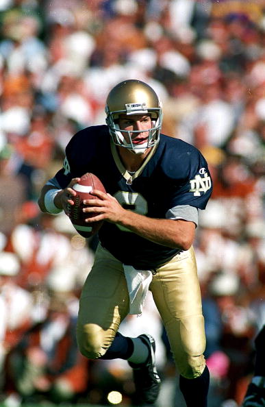
#7 2001-03
Tradition (3): 1.4
Style (2): 1.9
Success (1): 0.3
Package (3): 2.8
Score: 6.4
A personal favorite of mine. This specific home uniform didn’t debut until September 22, 2001 and was largely overshadowed by its more controversial away set that featured wide gold flanks down the entire sides of the jersey. The tragedy of the September 11th attacks delayed Notre Dame’s first home game and when they finally took the field in South Bend, an American flag patch was added to the the left chest and back of the helmet. The jersey patch stayed on through the 2003 season while the decal on the helmet has remained ever since.
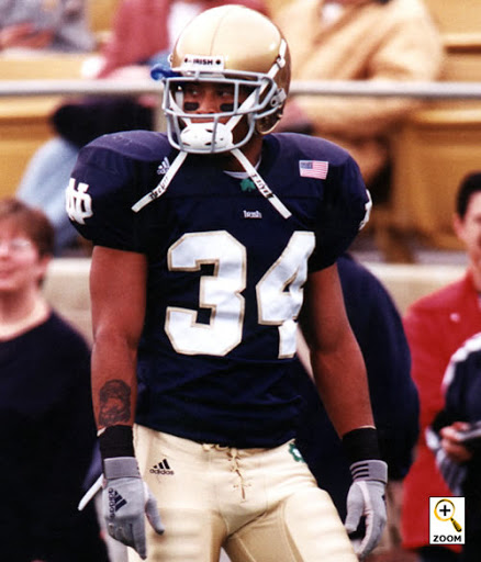
The addition of the green shamrock to the collar of the jersey and left hip of the pants is probably my favorite change in this series. The “Irish” script on the front, while probably too small, was also a subtle nice touch too. However, besides a brief Return to Glory these uniforms were worn for mostly a lot of losing but when I see one in the wild at a tailgate I still smile.
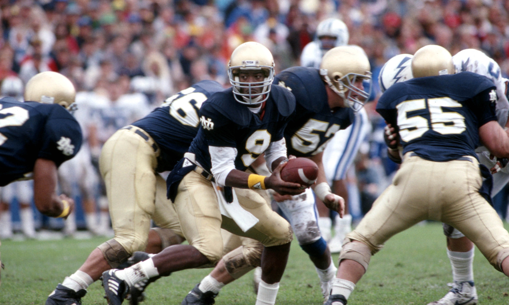
#6 1992-93
Tradition (3): 2.3
Style (2): 1.5
Success (1): 0.7
Package (3): 1.9
Score: 6.4
Now we get to the debut of the jerseys with the gold trim at the collar and sleeves without any other logos. This has always been a nice 2-year window into an evolving uniform that would begin to change over the years. You still see a lot of the same bones from the 1980’s uniforms except with a nice little update and a peek at what was to come for the rest of the 1990’s.
I’ve personally never been a fan of the gold trim on the blue jerseys but some people love it. The team also started wearing a lot more coordinated black accessories (gone was that pesky yellow) and it also helped that the Irish were dominant at 22-2-1 with 2 major bowl wins in these uniforms. Tons of good memories.

Of this group, I would probably choose the 01-03 jerseys as my favorite. I really like the ND on the sleeves as well as the small touches with the green shamrocks.
With some of the others, I am not sure if I really like the gold trim
Would Love to see a throwback with the gold trim and golden dome on the collar. Would like to see home jerseys incorporate a shamrock in some way. Color or pants.