
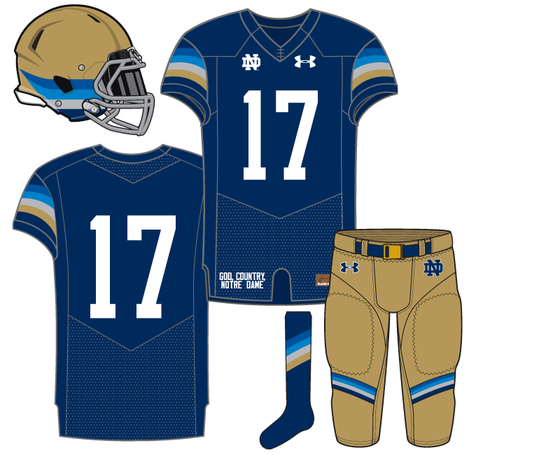
Our second uniform concept for Notre Dame football had one of the more adventurous beginnings. The original idea that gave way to this final design was to put together something that combined 4 or 5 shades of blue with a splash of white. We’ll probably revisit that at some point but for today the plan evolved into something different.
Our Irish Whiskey Sunrise instead went with only three shades of blue while adding gray and/or gold into the striping mix. The initial mockups had further striping on the collar but we decided to remove that to finish things off. The end result for this jersey actually was a lot more staid than the more wild rough drafts.
With the unusual striping pattern limited to the shoulder sleeves and the simple use of white on the front of the jersey this is something that is clearly different but not so out there as not to identify with Notre Dame.
The helmet is arguably the center piece of the whole set and continues the theme with the jersey. It’s a bit radical but within the traditional Notre Dame helmet set up. A gold helmet wasn’t originally part of the design but with it involved it allowed us to keep the gold pants and an overall traditional Fighting Irish color scheme.
We liked this one because at first it seems pretty weird, but after some time it’s actually a lot more middle of the road and digestible.
Up next a 1924 Faux Back…
I like the concept of this one. I wonder how it would look to switch out the grey for a splash of green.
Maybe something like:
I like that with the green. The grey just doesn’t do it for me. Makes it look a little too bland.
I’m not a big fan of blue and green together for ND but it’s used a lot nowadays.
[stares at women’s hoops]
We do have a concept coming up that is mostly green and blue which I think is nice.
It’s not creepy at all to stare at women’s hoops.
Not bold enough. I like the sleeve stripes, but think they would stand out more on a white jersey or maybe would be good going across the entire shoulders, not just sleeves. Think the pants need more or bigger stripes, maybe wrapping around, or all the way up the side of the legs.
Love the socks. Would buy those.
I think these could potentially look a lot better in real life than in the mock up, just because the mock seems to have kind of muted colors. Doesn’t pop enough (maybe an inherent problem mocking up navy blue uniforms).
The jerseys make me crave a mai tai and some smoked boar roasted on a coals topped by banana leaves.
And until further notice, the helmet shall heretofore be referred to as the “ND Wolverine”
Oh my god, please get the wilder rough drafts in front of Under Armour tomorrow. I want to see the ND Nation reaction when ND comes running out of the tunnel in those. Might set a record for most simultaneous heart attacks.
We call this next concept…Murder.
Is there technology to embed a jumbotron IN the helmet?
Meanwhile, the lads over at the other site are literally getting sick to their stomachs watching the latest update video for Campus Crossroads. Can’t make this stuff up folks.
As others mentioned, I would go bolder with this. I really liked USF’s “Tequila Sunrise” set and Hawai’i’s Rainbow set.
USF:
Hawai’i:
Big fan of both of those.
Really dig the uniform series. I’m wondering if you plan to release a concept for how you would like the traditional home and away uniforms to look. I believe you’ve mentioned before about adding some white or gold to the home tops…I’m curious what you have in mind.
These are awesome. Checking out both of those makes me think the stripes all the way up the shoulders, and up the side of the pants would be awesome.
These Hawai’i unis may be my new favorite of all time.
I have a “what if Under Armour tried something different but within the style they’ve been using for ND athletics” home uniform concept done.
Not a huge fan of the stripe concept on the pants. I think I’d personally go with the all gold pants and outline the ND and UA logos with the light blue. Not sure if those helmets in real time would look great either, but maybe. In my mind at least, that helmet concept with the lines going across on the bottom half is typically associated with matte helmets? I can only think of matte helmets with it. So that’s probably just my faulty memory.
Loving the jerseys, though. I actually like the lack of a border outline with the white numbers in theory. Although the lack thereof gets associated with a practice jersey for some reason in my little head. Not sure if it would have the same effect in real time or not. Probably not since there is other cool stuff going on.
I generally love matte helmets. Wonder what sort of matte gold we could pull off. Would probably come off terrible as some bland gross mustard color.
BUT
A helmet that is matte navy, with a giant, reflective gold Dome starting at the base in back, with Mary pointing up over the top!
I like this one too, except the lighter blue sticks out too much for me. I like three stripes better than four, too, so I’d get rid of it and reposition the stripe set. Except in the helmet. There I would replace the light blue with the medium blue, and the medium blue with navy.
So, I did not like the white uniform concept very much, but I actively hate these. Sorry Eric. They remind me of all the bad 70’s uniforms that came out after the Astros knocked it out of the park with their multi colored tops years ago. Not only that, but for some reason, these seem rather effeminate to me. Maybe it’s the combination of the baby blue and rainbow stripes. I also dislike the little horizontal stripes on the pants. On the white unis I liked the side stripes and all white concept. Here, I can’t get behind any of it.
All that being said, however, I am looking forward to seeing more of what you’ve got, though! This is a fun off season exercise and I appreciate the time and effort it takes to come up with them.
This one seems effeminate?
Hoo boy, buckle up it might be a long series of concepts for ya.
There are “more effeminate” concepts coming up? Yikes! Anyway, like I said, it’s a fun exercise. Just promise me you ywon’t apply for a job at UA!
Well, if baby blue and sunrise striping are considered “effeminate” then I think a wide variety of concepts could be considered as such!
Also, probably not the best term to use.
Yes, i probably should have used a different term and, to be sure, I in no way meant to disparage females in any way by my comment.
It’s all good.