
Now the top 50 countdown begins. In case you missed it, read the honorable mentions article. We are using old logos, alternate logos, secondary logos, or primary logos that are no longer in use. Today, we’ll unveil our first five logos on the march to the top spot.
All logos and information are courtesy of SportsLogos.Net.
#50
Vanderbilt
Type: Primary
Years: 1984-1991
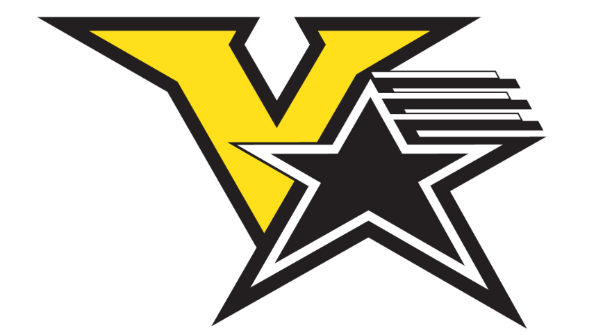
Vanderbilt just re-branded prior to the 2022 football season and it was truly uninspiring. The school seems to be having a long-term fight over whether it really wants to go with the star as a piece of their logo and then turned away from it last year. One look at this creation above from 1984 and this is something worth keeping. I like that out of all of their logos it’s the least stuffy, too.
#49 Stetston
Type: Alternate
Years: 2008-2017

This was another logo brought up in a Rambler article in the past. Out of all the 50 submissions this may be the most “WTF” of the bunch. I just love this damn hat and it’s uniqueness.
#48
Southern Illinois
Type: Primary
Years: 1964-70
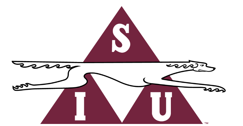
As you can imagine with a dog as distinctive as the saluki, Southern Illinois has put together some wild and interesting logos throughout the years. For the last 40 years, they’ve resorted to showing just the dog’s head which doesn’t do the breed justice. Look at this long good boy! And a triangle in the background, that’s different too.
#47
San Diego
Type: Secondary
Years: 2006-Present

We do not condone bullfighting on this website. That being said, this torero logo is pretty slick. From 2006 until 2016, this bullfighter sat atop a bunch of script on San Diego’s main logo, but I like the mascot on its own in this secondary logo.
#46
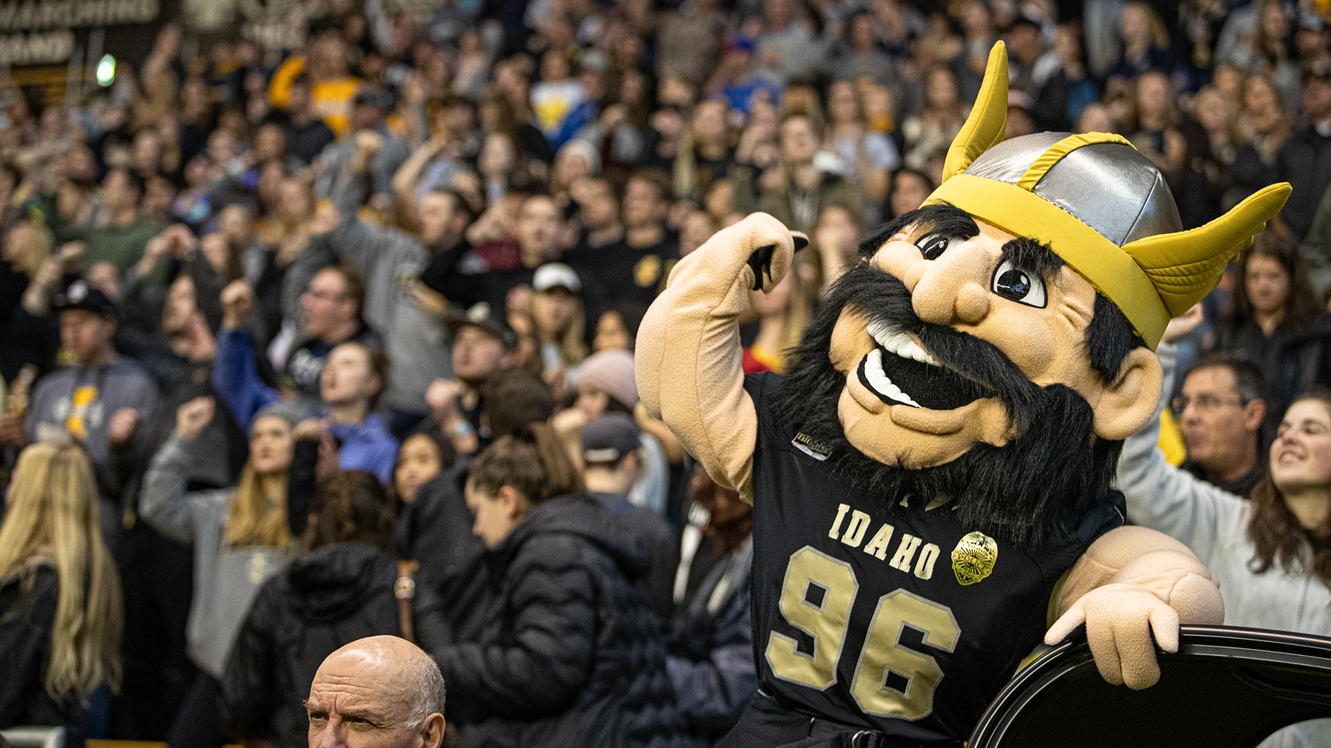
Idaho
Type: Primary
Years: 1946-1967
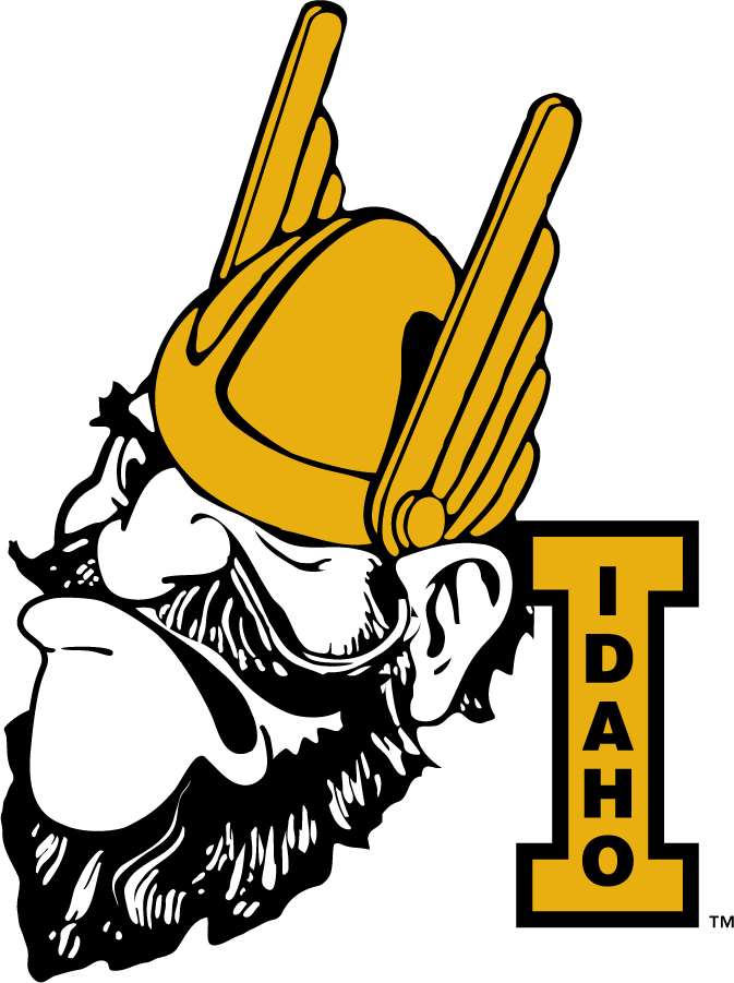
Full disclosure, many would argue the follow up to this logo in 1967, basically a slightly altered version with a smiling vandal, is far superior. I won’t fight you on that. I do like this angrier version, though. Is he drunk? It seems to fit a sporting atmosphere more than the jolly vandal.


First off, kudos to you for continuing to put out all this content with a house full of kids plus work, it’s impressive and I appreciate it!
My vote from this group is the Vandal.
Sidebar, I believe for Southern Illinois the triangle is actually a pyramid and an ode to the area being called Little Egypt. Don’t hold me to it, but I also believe that’s why they chose the “Saluki” which is an Egyptian dog. Coming from a Northern Illinois Huskie I can appreciate what the two schools did here whether it was intentional or not.
See, I love the research!
Also, there’s a non-insignificant chance there are still signs around SIU-Carbondale’s campus with that logo still – if not just the triangulated “S-I-U”
Oddly enough, the “Little Egypt” idea was first applied around the area that became known as Edwardsville, which is home to the sister SIU-Edwardsville (and as of a few years ago, the larger of the two schools). There are still references around Edwardsville to “Goshen” which is what Egypt was called back in bible times. Nile-like flood plains of the Illinois-Missouri-Mississippi-Ohio River confluences and pyramid-esque mounds were the rational for the Egyptian allusion. Cairo, Thebes & Karnak are names of cities still around in southern Illinois.
*rationale
I’m pretty sure the bookstore was selling the Idaho mascot on Irish gear…only with an Irish hat and muscular arms.
https://encrypted-tbn0.gstatic.com/images?q=tbn:ANd9GcTee0dqDvE4mr5dgcaDyna0UbPJgrgfFaXHUQ&usqp=CAU
I had a buddy in college who wore a hat nearly every day with this guy on it. Rock on, but also, no.
I’m going to guess it was a white hat and fully yellow’ed with sweat
Only 44 more to go until we get to the old Longwood logo!
The cowboy hat for Stetson absolutely rules
Not to sound too much like a haberdasher, but I’m pretty sure the hat is a Stetson hat.
I assumed that the logo was a winking joke by the school, but TIL it’s all the same Stetson: https://en.wikipedia.org/wiki/Stetson_University