
Welcome to this website’s off-season sports sartorial content. We are counting down the world’s top 50 most iconic sports uniforms. Only current uniforms apply, we are not including one-off or alternate uniforms. Let’s stick to the basics.
#33
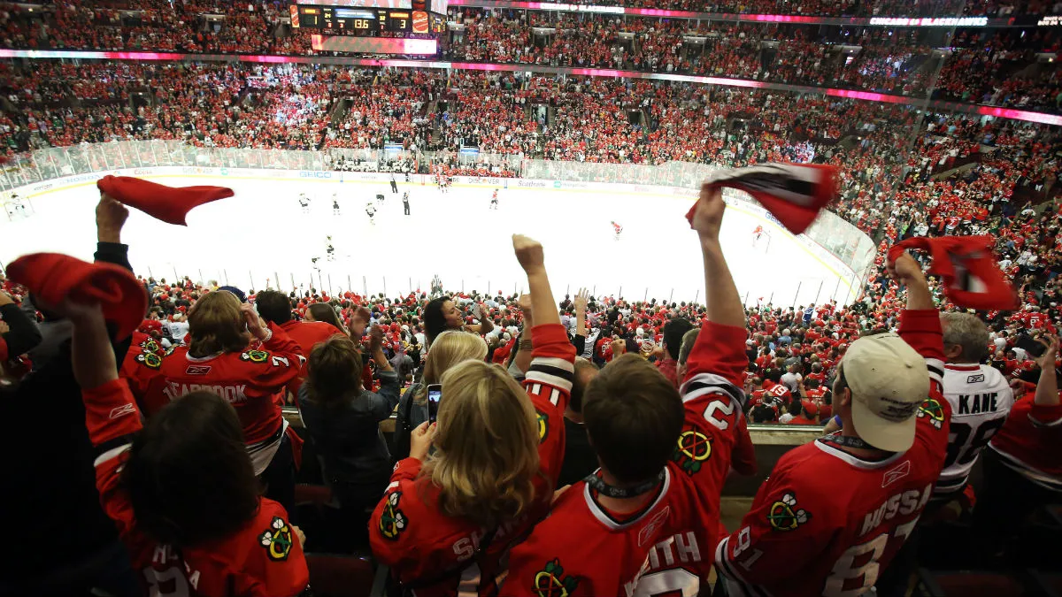
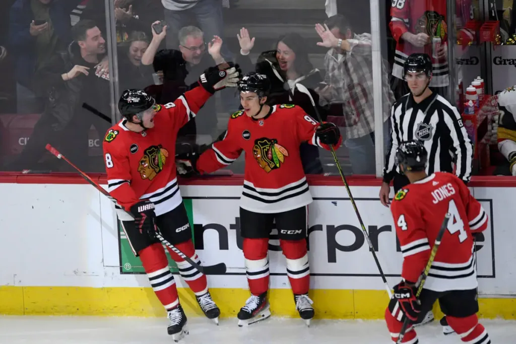
Chicago Blackhawks
We are back with yet another Chicago sports franchise making the list. However, today isn’t all fun and games. It’s difficult to asses the Chicago Blackhawks uniforms due to their controversial nature. Based purely on looks, colors, and design many consider this the best uniform in the NHL. Certainly, in year’s past it was frequently atop many lists in the NHL.
Today, not so much. The first link I checked for the best NHL uniforms had Chicago in last place due to their continued use of their mascot and jersey logo.
That might be completely fair. I don’t wish to get into that debate today but suffice to say it’s a real concern for Chicago that would probably get more national attention if hockey were more popular across the United States.
This uniform layout debuted for the 1955-56 season and has been changed very little ever since. Originally, the sleeves featured 2 black and 3 white stripes but this was changed in 1962 to the current design. For 1965, a more modern Blackhawk crest debuted. In 1973, black trim was added to the player numbers. For the 1999-2000 season, the tan outline on the jersey logo was removed.
That’s about it for changes. The only thing in recent years is the truncated collar stripes that have been in place since 2019 with the Adidas jersey template. It looks pretty bad and shows that maybe the jersey would be better off with no striping on the collar at all.


Growing up in Illinois, I’ve flip-flopped a few times on how I feel about the Blackhawks logo & mascot – which ultimately, means very little as a non-Native American.
Having said all of that, I do like that these uniforms, and almost all Chicago uniforms, have changed very little over time.
I find this question a difficult one. I will say as someone who grew up in Atlanta, the tomahawk chant feels icky.
It’s definitely an emotionally charged subject for many, but obviously the Blue Jackets have an almost identical mascot source and their complete refusal to reference it makes it almost detract from any support of the guy. It seems almost more offensive to name it after him and then ignore the reason.
I thought it was some sort of cannon?
Their jerseys have had a star with a stylized Ohio flag or a beribboned hockey stick (terrible old logo) but I think he means that the Blue Jackets name and color is a shout out to Ohio’s Civil War regiments.
That’s significantly different than a Native American military leader
Blue Jacket is a Shawnee chief from the Dayton, OH area.
There we go
They have an outdoor theater near Dayton that did a play related to his life. I think Bruce Campbell once played the lead. It was a pretty good show.
Famed Native American, Bruce Campbell
Actually, to make things confusing…Blue Jacket wasn’t technically Native American either. Some real life parallels to Dances With Wolves.
There was a Shawnee chief by that name that idocd mentioned but that’s not the origin of their name. Their own media guide makes no reference to him but cites Ohio’s contributions to the civil war and, apparently, that the blue uniforms were made in Columbus.
I think they are trying to avoid any controversy, but I’d be surprised that a famous historical figure in Ohio named Blue Jacket has nothing to do with a team less than an hour away named the same thing. It’s like when the Baby Ruth founders said it had nothing to do with Babe Ruth to avoid paying him anything…”it was named after the president’s daughter.”
But again, a complete failure to reference it avoids controversy but detracts from the original figure.
There was a fighting green bug during the Civil War?
They’ve said it for like 30 years now and have consistently used Union army imagery for the team, I’m pretty comfortable claiming that’s where the team name comes from and not an obscure historical figure from a different but pretty close metro area.
The team being that old makes me feel sooo old.
Right? I guess it’s not quite 30 – formed in 97 and started in 2000 so more like 24+, but still.
I’m an absolute Blackhawks hater despite being from Chicagoland and now living in the city for the entirety of their post-Dollar Bill Wirtz run, but these are the best uniforms in the NHL and probably all sports.
BOOOOOOOOOOOOOOOOOOOOOOOOOOOOOOOOOOOOOOOOOOOOOOOOOOOOOOOOOOOOOOOOOOOOOOOOOOOOOOOOOOOOOOOOOOOOOOOOOOOOOOO
4th or 5th best red jersey in the entire nhl
All red jerseys are bad
i’m sorry i can’t hear you over how awesome the sparkly silver stripes are in raleigh
Predicting the #1 Carolina Hurricanes
you know you look into it and it’s true
Those suck so hard
see the best one is the 25th anniversary jersey from last year but eric said no one offs so!
Literally, they look like that one picture of a black hole
They are mentioned in this week’s Rambler!
Carolina’s hockey uniforms are really bad. I think your picture is their uniform dropped after 2013, too.
The current one also sucks, sorry!
Carolina’s older ones are definitely better.
Related. What about a series on the best team songs.
This off-season I was going to do a top list of the best college fight songs, but it would be a lot of work.
Enjoy your kids, man.
What did MJ say…
Depends on which MJ you’re talking about, though it might apply to both
Oh no hahaha
those who cannot see what our forefathers left for us are unfortunately blind heretics
the great journey will continue unabided!
That’d be embarrassing.