
Welcome to this website’s off-season sports sartorial content. We are counting down the world’s top 50 most iconic sports uniforms. Only current uniforms apply, we are not including one-off or alternate uniforms. Let’s stick to the basics.
#43
Chicago Cubs
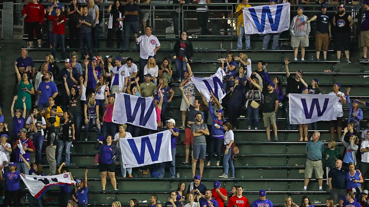
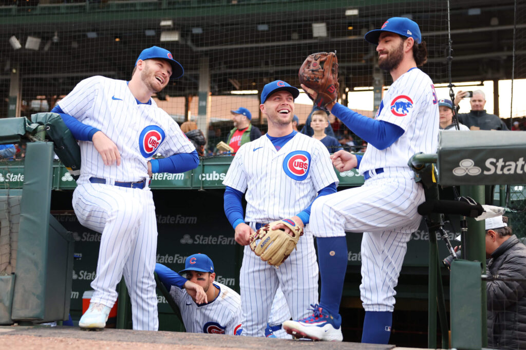
What can we say, pinstripes work really well in baseball. Today, we focus on the Chicago Cubs home uniform currently basking in all its glory just a mere 7 years after its last World Series Championship.
Like many of the ancient baseball clubs in America, the Cubs went through a lot of uniform changes in the early years. For the first 50 years there were seemingly changes every season and it wasn’t until 1927 when Chicago began fully incorporating a balance of red and blue together. That was also the first season in which a semblance of the modern uniform was unveiled.
The large round “C” logo on the chest didn’t come until 1937 and it was enclosed in a thin blue circle for the 1941 season. Although the team had an on and off again relationship with pinstripes through the decades, they finally settled on pinstripes at home for the 1957 season which is also the same season the chest logo on the jersey was updated to a more modern and familiar design.
Elastic waistbands famously showed up for 1972 and this was the home look for the Cubbies during my childhood before the team reverted back to blue belts in 1990.
The home uniform has largely remained the same for many years. A thicker blue circle around the jersey logo came in 1979 and while a small cub face patch came on the left arm in 1962 (enclosed by a red circle in 1979) and lasted until 1997 when they instead opted for a blue walking cub inside the red “C” logo ever since. I prefer the former sleeve logo as it’s more distinctive and not a repeat of a similar logo from the chest.
Overall, the Cubs home uniform continues to look crisp and bold with a white and blue color scheme added with a splash of red, especially the chest logo red that really pops. The team could easily add a player number to the front of the jersey for easier identification but their refusal to do so adds a certain charm. With their standard blue hat and red/white logo (worn since the 1958 season) it completes one of the best looks in North American sports.


Can’t stand the Cubs uniforms, both home and away
Boooooooooooooooooooooooooooooooooooooooooooooooooooooooooooooooooooooo
Seconded
I’m neither a Chicago or Cleveland fan (and I really actually kinda don’t like either team) but I rewatch the 2016 World Series almost yearly during the offseason
Both uniforms were very sharp and the whole story and greater context beyond the games themselves (which were also awesome) makes it one of the more powerful sporting events of the 2010s I think
It did bug me that Chicago wore their alternate blue jersey when winning it all, though.
honestly personally their blues are my favorite ones they have although i am aware that is a bad opinion
Even as an utter baseball phillistine, I’m surprised this isn’t higher. How many MLB teams are left?
The oracle says only 3 more MLB teams!
Am I being a complete homer or do the cards have to be on here?
I like their chances 😉
Presumably in order of appearance: Cards, Dodgers, Yankees (potential #1 overall, as much as I hate it)
I hate the Yankees. But they have to be #1. The hat alone would probably qualify for #1. Then you add a uniform that has a CFB bowl named after it.
Baseball pun!
Baseball’s hat game is on point but uniforms as a whole are a lot more bland. Something like 26/32 of the teams are blue, red, or blue and red as primary colors. Everyone basically wears all white and often all gray. If jerseys break from the mold too far they quickly look like BP uniforms. The only one I would really want to see called out for excellence is the As, though there are others I wouldn’t fight over.
I would put these at or near the bottom of the Chicago Pro Sports uniform list. I would for sure take the Bears and Sox, probably the Blackhawks, and maybe if I squint, the Bulls as well.
In general, I think Chicago does pretty well with its pro sports uniforms. I haven’t seen this season’s home uniforms, but the Chicago Red Stars definitely used to have some nice home uniforms too. The Sky and Fire have both had ok to solid home uniforms over the years.
Sounds like Harbaugh is officially HC of the Chargers. Good effing riddance. If Moore gets the UM job (I also read that BK was a top candidate, lol), it will be interesting if any of the NCAA investigation/punishments will come down on him at all since he was part of the staff.
Did Harbaugh leave just to avoid sanctions? He’s seemed like the slimiest coach to me, ever since I first heard about him (49ers).
He left because an NFL team wanted him. He would’ve left before now if one had offered him enough.
I do love that Michigan even capitulated to his no fire clause in his contract like 2 days before he left. It’s great seeing them so desperate for a guy who got suspended twice last season, was likely to be punished again in the future, and who was obviously looking to leave anyway.
That’s also one of the most insane clauses I’ve ever heard of. I don’t care if he’s a good family man, that’s such a huge vulnerability, especially looking at some of the reasons a bunch of Big 10 coaches have been fired in the past 12 years.
Eric, ignore the Philistines who are booing your selection of the Cubs uniforms for this list. They truly do not understand that Cubs fandom is a higher order of existence.
To give you an idea of my level of Cubs appreciation (other than my screen name), some years back, my wife bought some porcelain figurines to place in the middle of our dining room table. When I came home from work and found them, they were banished to permanent storage somewhere in the house (don’t know where and don’t care). The reason they were banished is that they depicted two Cardinal birds, perched on branches. To this day, my wife bitches at me about their banishment.
Not in my house!