
Writing about 20 underrated sports uniforms from college football, NFL, MLB, NHL, and NBA. One uniform at a time.
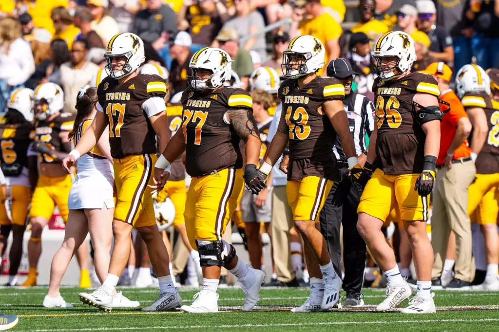
Looking through the archives, Wyoming football has dabbled with a Vegas gold color and like most modern teams mixed up their helmets from time to time. Although, the Cowboys have been fairly consistent with their home uniform through the years on a template of white helmet, brown jersey, and yellow-gold pants.
The first 15 years of this century weren’t a great look for the Pokes. They suffered from the excessive and unnecessary piping craze, adopted camouflage for a while, wore “WYO” on the front of the jerseys, and generally looked like a poor lower conference team. They are exactly that, but you don’t have to look like one!
During the Craig Bohl era, things changed.
They look like a proper football team.
A much more traditional uniform came back, although for the real uniform nerds check out all 3 striping patterns on the pants, jersey, and helmet being different. I’d argue a stripe-less helmet (something Wyoming has used quite a lot throughout their history) might look better.
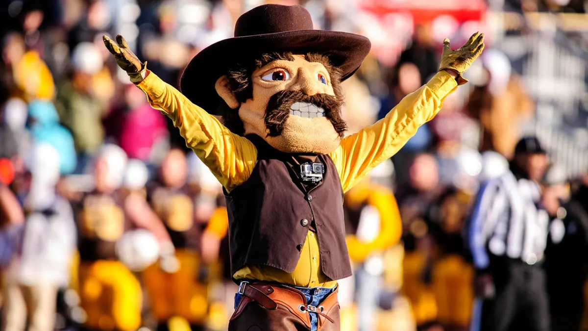
The Wild West font on the team name and numbers is a nice touch. You don’t want these uniforms to be too boring and that adds a nice little mascot appropriate theme in a way splattering some Pistol Pete logos on there just won’t work.


It’s hard to pull off the brown/yellow/white look, but they do it pretty well. Plus, I like that it’s not the same-old jersey color combo
Generally go to one Wyoming home game a year (thanks VetTix). On those down years, I swear the diehard fans take more pride in the colors than the team. Plus, during those November games, you can wear your Carharts and still identify with the team colors and the Cowboy way.