
Writing about 20 underrated sports uniforms from college football, NFL, MLB, NHL, and NBA. One uniform at a time.
I say this in the nicest way possible, nothing about the Minnesota Twins uniforms really stood out for many years. They debuted in 1960 with very basic navy blue and red uniforms that remained consistent until 1976 when red caps with blue bills were used at home.
1987 saw another change with the introduction of pinstripes on both uniforms, back to all blue hats for all games, and the “Minnesota” wordmark on the gray road jersey. They won a World Series championship in the first season with this look and then again in 1991. I’m sure many Minnesotans held that look very dear with all the winning.
Beyond very small tweaks, these uniforms remained for over 30 years!
You have my attention.
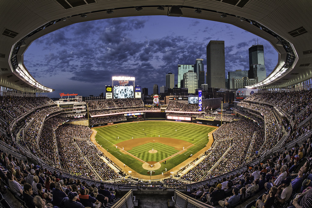
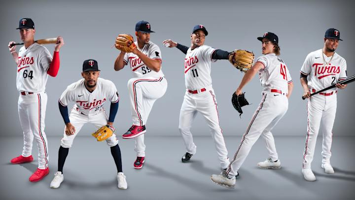
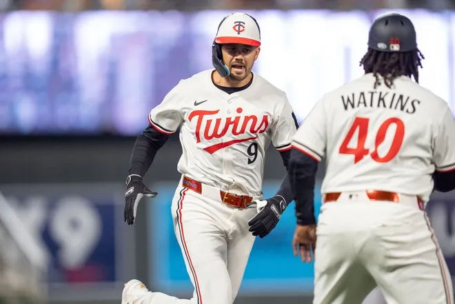
Ahead of 2023, the Twins went through a re-brand and it was lovely. Particularly for their new home uniform. The logo was slightly re-shaped and red became a much larger part of the home uniforms. In a sport awash in navy blue teams this was a welcomed decision.
Like many MLB teams these days, the Twins are sticking with their traditional hats (all blue) for the field but using the throwback white panel and red billed blue helmets while batting. The whole Twins re-brand didn’t get a lot of love at the time but I find these really underrated.


I really like these too. That Twins script logo really pops without any border (or garish drop-shadow — looking at you, Reds) and the red & blue are sparse enough on the white that they work extremely well together. To me, the whole package is close to on par with the Brewers, who are industry leaders here IMO.
As a uniform wonk, what are your thoughts on the lack of uniformity (below the waist) on baseball uniforms these days?
Looking at that upper picture, we have a mix of pants types (skinny jeans, baggy look, and one old school high socks) and a wide variety of shoe colors and types, some of which look like they belong to sports other than baseball.
It bugged me many years ago, but I’ve given up the fight.
Long baseball pants are an abomination. Anyone who wants to wear their pants like that is welcome to get an office job working with me. Have an extra pair of khakis for you waiting here, go all the way over your shoetops like a total OG baller. Otherwise, get thee in some proper goddamn stirrups.