

Writing about 20 underrated sports uniforms from college football, NFL, MLB, NHL, and NBA. One uniform at a time.
If you’re young you may look at the Chicago White Sox uniforms and think, they must have used these colors and designs for over 100 years. Nothing could be further from the truth!
After a brief dalliance with red, the team adopted navy blue colors for over 30 years then added red back to the team palette for a while before switching to a black and red color scheme. In 1951, with the black/red colors the team debuted the diagonal gothic “Sox” logo. In 1964, they switched back to all blue colors, then went to primarily red in 1971, then back to navy blue in 1976. Still following along?
The pullover era in the MLB saw the team go back to blue and red with the modern script “Sox” across the jersey. That stuck until 1987 when the team switched back to traditional button up jerseys and a script across the chest.
Everything changed in 1991 when the team re-branded yet again, and to date, for the last time.
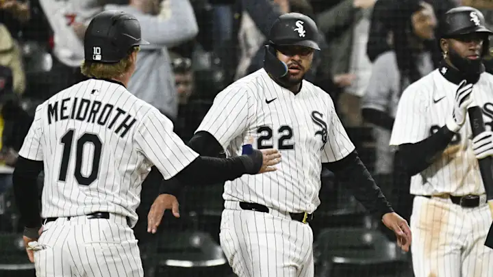
The diagonal gothic “Sox” logo was back and this time the franchise brought black back with a touch of silver trim. These white home pinstripe uniforms are criminally underrated. I quickly looked around some best of list and the Sox land usually right in the middle of the MLB. Absolute nonsense. They’ve basically changed nothing on this uniform over the past 35 years and their colors continue to stand out in the Majors.
I’d also point to the lack of anything on their sleeves as brutally traditional, plus the matte black helmets in recent seasons really pairing well with the overall uniform. The Pope approves I’m sure.


Finally, deserved praise. Yeah yeah the Yankees pinstripes are iconic because of their wins, these are still great looking uniforms.
I looked up those 1951 uniforms and those are really nice — https://www.sportslogos.net/logos/view/5533201951/Chicago-White-Sox-Logo/1951/Home-Uniform