
Now we have arrived at the mountain top. What are we doing? We are ranking the best Notre Dame football home blue uniforms of the modern era. Check out the introductory post for the reasoning behind this and how we’ve graded out each uniform, plus the previous two articles containing our rankings before today.
Ranking Notre Dame Football’s Home Blue Uniforms: An Intro
Blue Uniform Rankings: The Bottom 5
Blue Uniform Rankings: The Middle Group
Today, we look at the top 5 home uniforms in Irish modern history.
#5 1998-2000
Tradition (3): 2.0
Style (2): 1.8
Success (1): 0.4
Package (3): 2.4
Total Score: 6.6
I had a poster for years with the team raising their hands in a huddle while wearing these uniforms and I’ll forever think about that when I see these beauties. These were the final Champion uniforms and the best they had to offer once they started making subtle changes in the 1990’s.
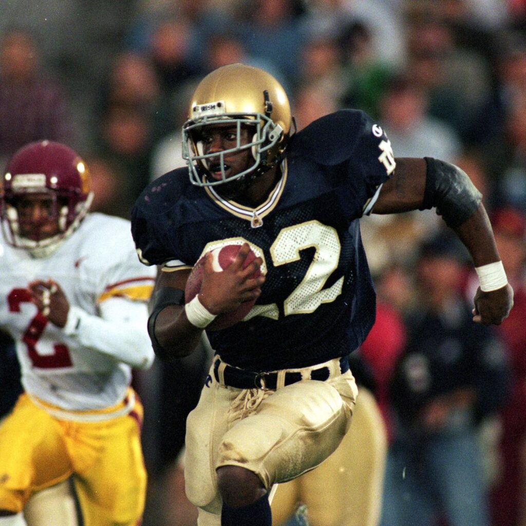
The gold/blue/white/blue/gold striping on the collar and sleeves was always subtle enough to not look too crazy but different enough to look better than the previous versions with the dome at the collar. Obviously, not a ton of winning in these uniforms though. One small and interesting tidbit: In this era, random players wore black chinstraps then this practice disappeared when the Adidas uniforms arrived.
#4 2014-15
Tradition (3): 2.6
Style (2): 1.7
Success (1): 0.4
Package (3): 2.1
Total Score: 6.8
The beginning of the Under Armour era and progress towards a very stable look that has persisted to this day. While the Baltimore-based company has fallen on hard financial times recently, back in 2014 they were soaring in the apparel market and endeared themselves to Notre Dame fans by sticking to a very strict traditionalist template for the uniforms.
While the team continued rotating in multi-colored cleats and gloves, above is one of the cleaner looks of the era with Will Fuller in primarily all-gold accents. The debut season in these Under Armour uniforms wasn’t great but they came back with a strong 2015 and trip to the Fiesta Bowl.
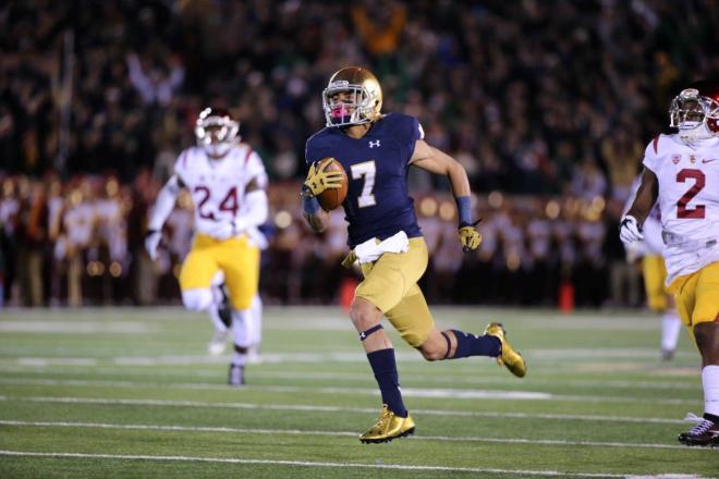
#3 2012
Tradition (3): 2.4
Style (2): 1.7
Success (1): 0.7
Package (3): 2.1
Total Score: 6.9
The first look at what would become Notre Dame’s modern uniform. The new helmets debuted in the middle of the previous year while the mustard pants were unveiled across the Atlantic in the 2012 opener against Navy in Ireland. When the team arrived back home against Purdue we got our first look at this new look in blue.
Admittedly, it’s a very haphazard look but it’s like watching a young doe find its legs. The cleats were various colors, compression shirts unveiled a more modern look, and this was an era when many players really started wearing tights for most games. For example, you can see none of Golson’s tights, socks, or spats match each other. But, this was a very fun year and these uniforms do have a special place in our minds.
#2 Early 1970’s
Tradition (3): 2.7
Style (2): 1.3
Success (1): 0.7
Package (3): 2.3
Total Score: 7.0
The Ara Parseghian era was known for Notre Dame shucking its decades-long association with green and returning to a very basic blue uniform. That is, until the counter culture of America took over and he allowed a little bit of pizazz! However, the plain blue uniforms remained the same.
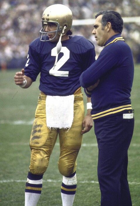
Where this uniform shined is with stenciled stars on the helmet (sneaky revolutionary decision from Parseghian in hindsight as he’s the only one to adorn the helmets with something on the standard uniforms for the past 50+ years) and the best socks the team has ever worn. Hopefully, a throwback uniform is created to honor this period.
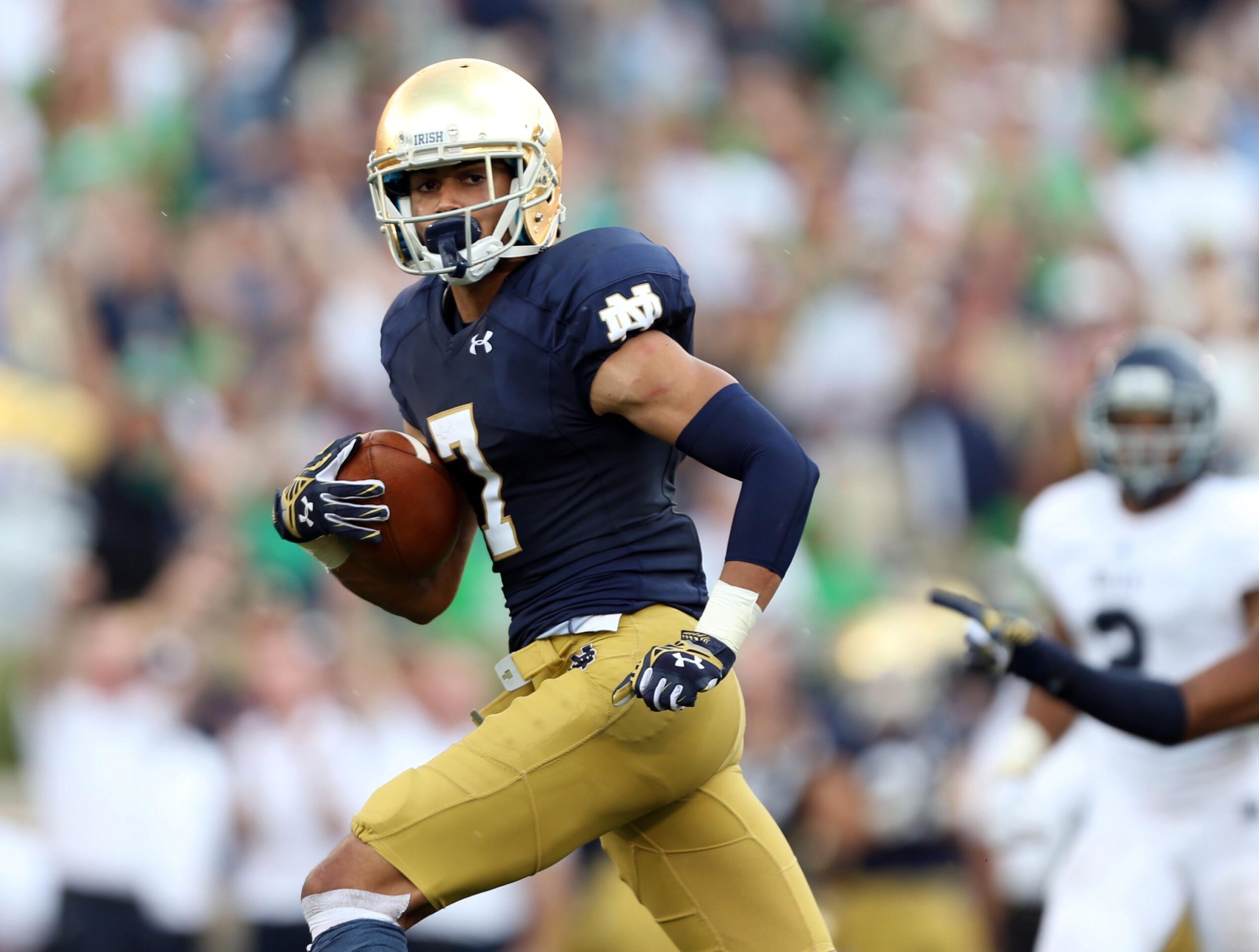
#1 2016-2020
Tradition (3): 2.7
Style (2): 1.8
Success (1): 0.6
Package (3): 2.5
Total Score: 7.6
Our top spot goes to the current uniform set worn by Notre Dame! It took a while to work things out but they finally got there. The pants and helmets have remained consistent for several years while beginning in 2016 the jerseys were upgraded to the Leahy font (a skinnier and slightly taller font) player numbers.
These uniforms came out of the gate with a lot of losing but have since rebounded in a big way. They’ve also been helped by improved details, including the program choosing to remove a lot of the gold in the cleats and gloves while relying much more on white. They’ve also walked away from the base layers from the early Kelly era and in general the team looks more uniform today than they have in the past.

I agree with the #1 spot — the current unis are nice (but could be improved by adding a small shamrock on the pants). But I cannot believe what you put at #2 — is that a historical nod? I’m not sure if I like those much at all — no outline for the numbers, stars on the helmet, no ND logo…I’ll stop there
UA has nailed the exact right shade of blue, IMO. Most of the Adidas efforts were too dark — the 2013 jerseys were practically indigo.
That said, when the team came out against Navy in 2012, I remember thinking, “Oh, it looks like someone finally dusted off the uniforms.”
I remember when I first saw the Navy game and the mustard pants. It was a “WHOA” at first, and by halftime I was firmly in “if they ever change these pants I’m storming the castle” territory.
I was in Dublin again for that game. I remember thinking how weird our uniforms had been for the first game in Ireland, under Holtz, and how this look in 2012 seemed so much better. But I didn’t really focus on the pants until Tuitt ran that fumble back. He is so big, and it was so amazing seeing those strong legs move so fast (he was coming right at me) and I remember flashing on how good those pants looked!
All glory to Mustard Pants.
I wish we could see indoor shots of all the jerseys through the years in the same light and same camera. They seemed to get really dark during the Holtz era and well into the 2000’s while as you said Under Armour went back to a lighter shade.
I agree with current being #1. But 2016-19 current. 2020 with ACC patch and Rally patch, not so much. Way too cluttered by the time they got to the ACCCG and Rose Bowl to add even more patch space on there. @Maybe that’s why they didn’t play so well@
The best part of the #2 uni picture is the crappy tattered rag Clements has tucked into his pants. Talk about a different time. Yes, those socks are awesome.
Yup, I wonder if it was a lucky towel or miserly Notre Dame?
Back in those days you didn’t take a good towel out to play in the mud with.
I do like our current jerseys, but I strongly feel that the numbers are too small. They should be a bit bigger.